
ALLENAMENTO — Brand Identity ✻ 2024
Client name: Yvonne Hanssen
Rebranding Boutique proudly presents a fresh new logo / branding and a beautifully put together website project created for Allenamento. Yvonne Hanssen, the family therapist with more than 23 years of experience as a family therapist is the founder of Allenamento. Yvonne has specialised in divorce, complex relationships and personal coaching and treatment. Allenamento is rooted in Italy, a country she has fallen in love with. The name comes from Italian, meaning 'training & coaching' in English because she believes that we’re never too old to learn and develop.
Yvonne was in need for a corporate identity and thanks to Vinita Salomé, she got in touch with Rebranding Boutique. I have collaborated with Lisa Hall (creative direction and website design), Moran Greenwald (SEO consultancy) and Vinita Salomé (brand photography) in this project.
Right after the branding kick-off meeting, we have started with putting together a visual mood board and drawing some initial ideas on paper. The concepts were exploring the ideas of:
✻ solving complex and complicated dynamics and patterns,
✻ changing certain patterns,
✻ being a connector, explorer and a curious mind
✻ exploring other perspectives, going on a self discovery journey
✻ finding your new path and uncovering other possible routes
✻ coming out of the current situations as there is always a way out
✻ setting yourself free
✻ changing certain patterns,
✻ being a connector, explorer and a curious mind
✻ exploring other perspectives, going on a self discovery journey
✻ finding your new path and uncovering other possible routes
✻ coming out of the current situations as there is always a way out
✻ setting yourself free
These ideas made me start thinking about how I can visualise these concepts and coming up with images and forms that resonate with them. I have explored symbols and metaphors such as:
birds flying and taking off / mandala forms / spirals / crossroads / leaves and feathers / butterflies
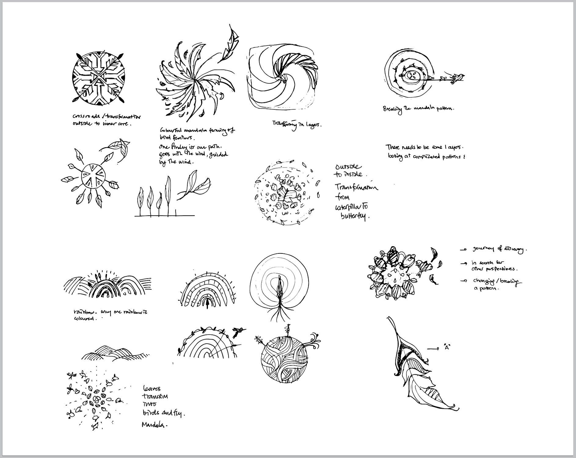
Hand-drawn sketches for Allenamento logo design
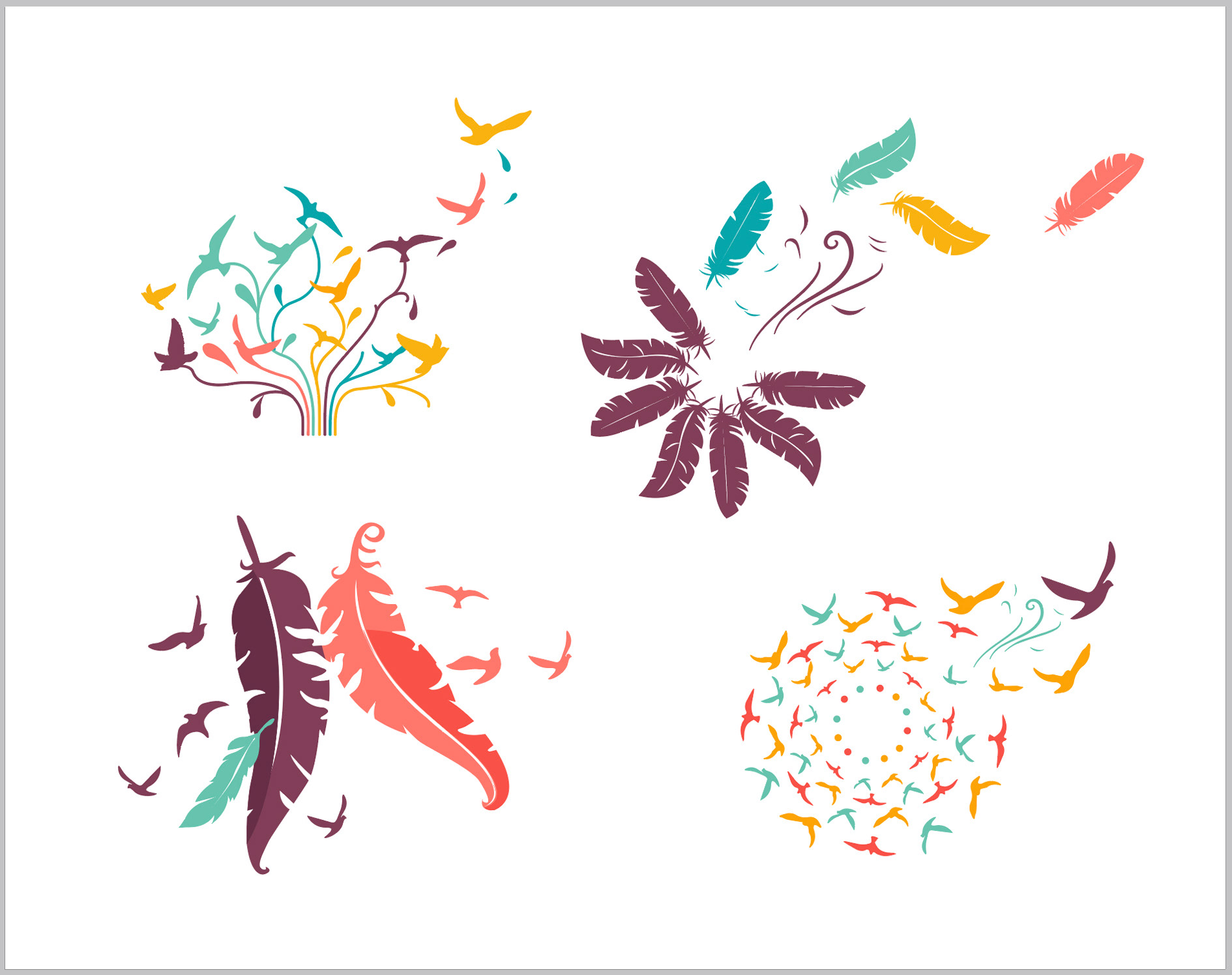
Initial emblem ideas for Allenamento logo design
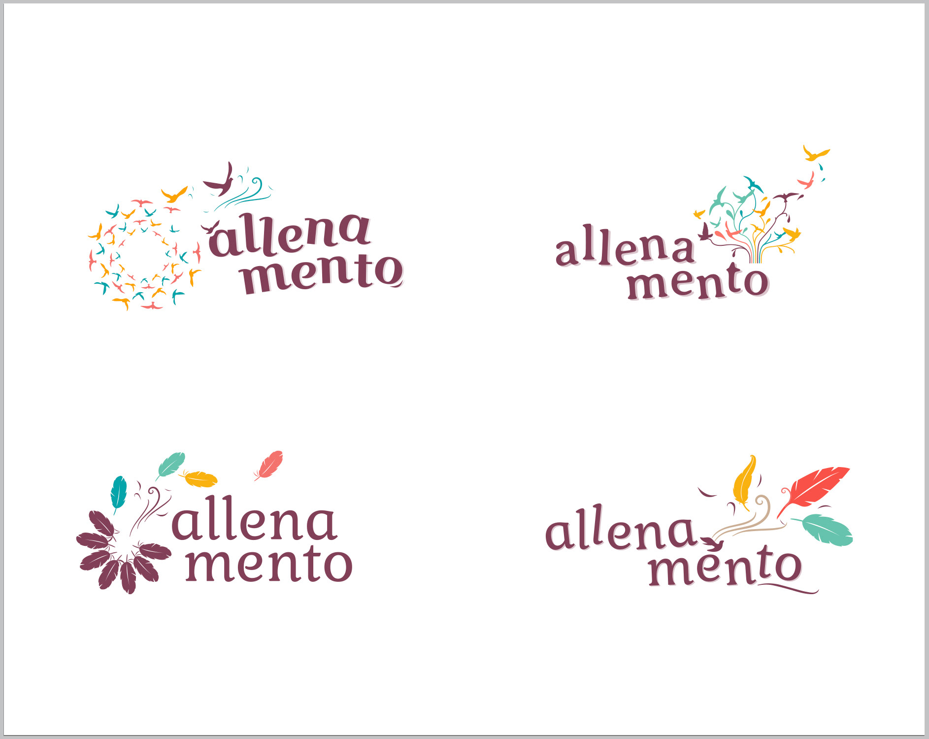
Different ideas for Allenamento logo design
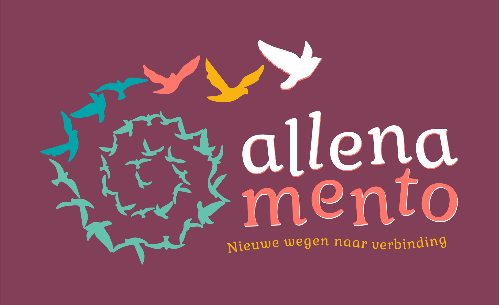
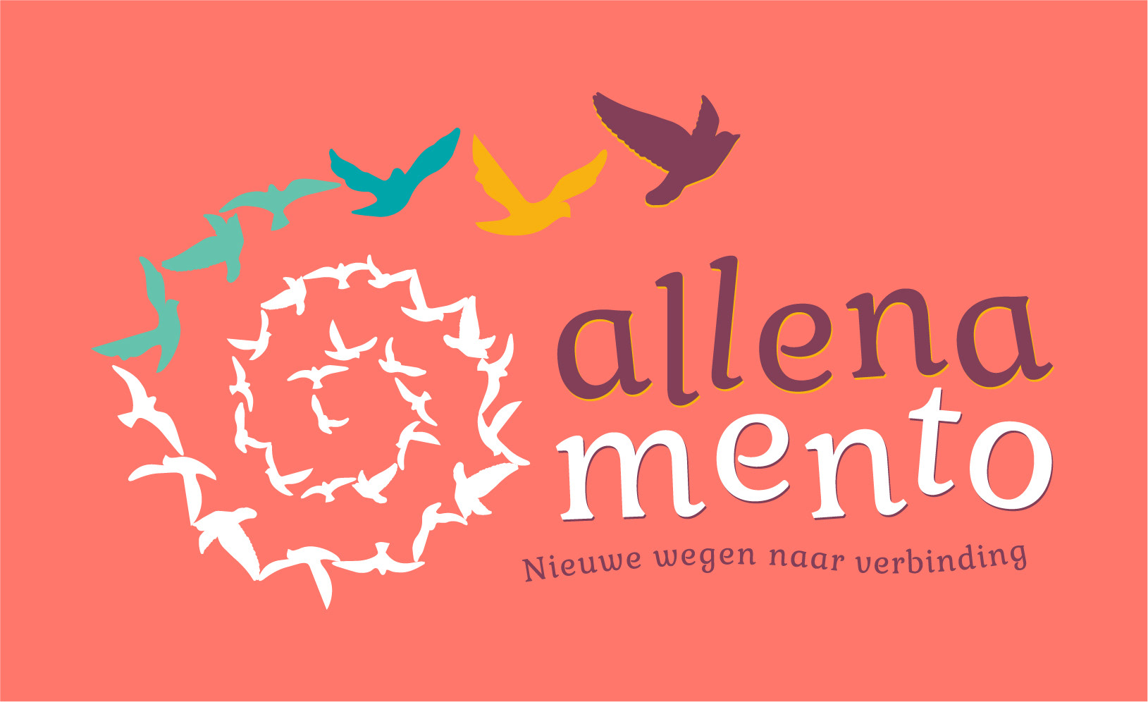
After having Yvonne's feedback, we came to conclusion that the idea having birds breaking the pattern, finding their own path, taking off with the guidance of the find, going on a new journey was the strongest. I have developed the sketches further and here is the final version of the primary logo!

Birds are in connection with each other while flying. Birds are also explorers and they see the world from a different perspective. The last few birds are leaving the herd to find their own paths and discover their own journeys. They are breaking the pattern thanks to Allenamento’s guidance. We can also say that they are breaking the repetition, and ready for self-transformation process that happens in stages.
Regarding the colour palette, Yvonne really wished her logo to be colourful and heartwarming. I also agreed with her on the fact that going for joyful, welcoming and inviting warm colours in balance with some colder tones in moderation would have been an ideal combination. There are 5 colours in the logo palette and these warm coral and ambers compliment teals and mauve creating positive emotions on the viewer. The typography is also moving and playful symbolising the transformation and the change that is about to happen. We have agreed on the fact that dividing 'allenamento' into two lines would make legibility easier helping the audience to keep the name in their mind. I have worked on various options for the logo and emblem, placing them on different colours of the palette, giving Yvonne the flexibility and variations to play with on social media and website.
logo on mauve background
logo on coral background
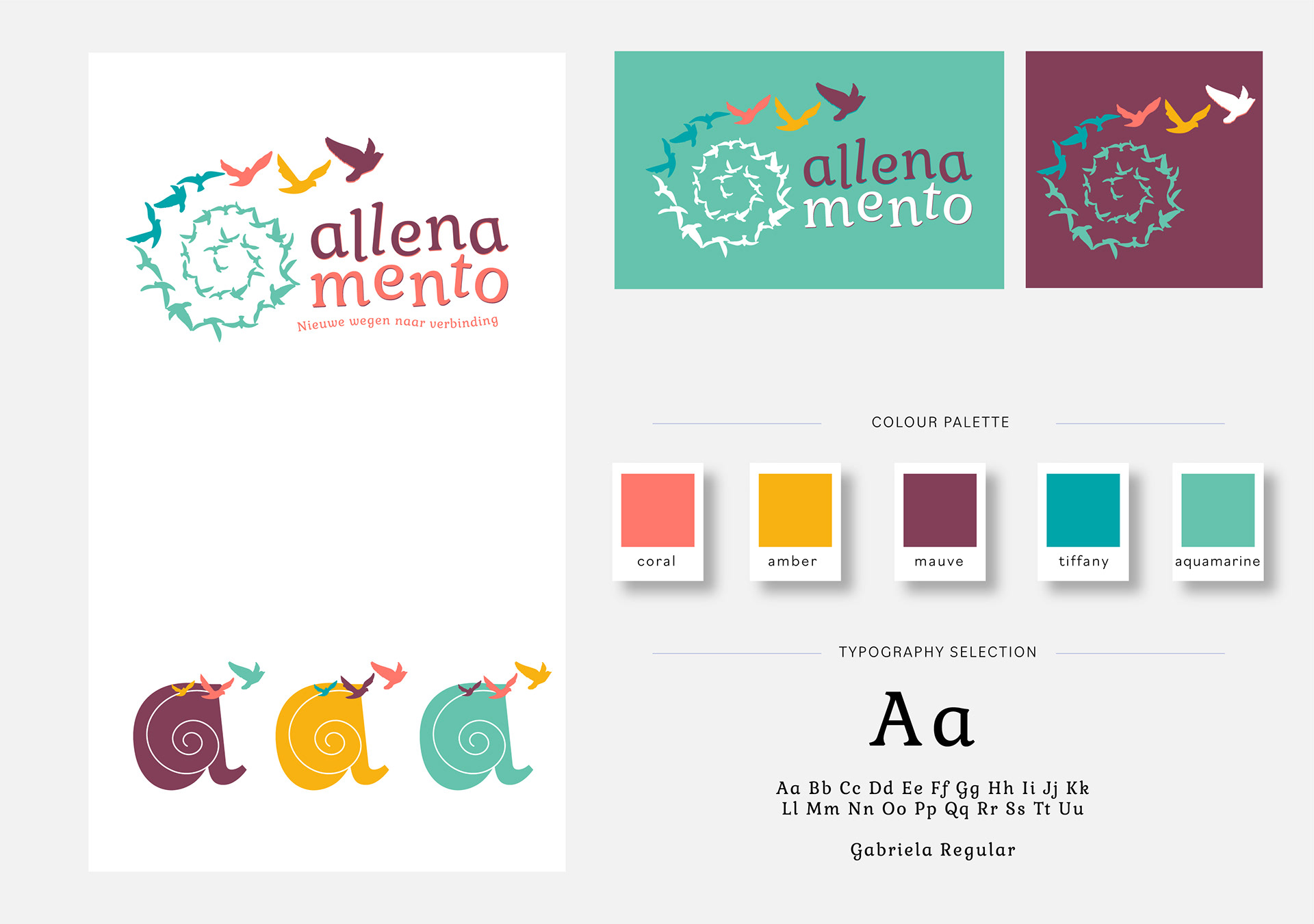
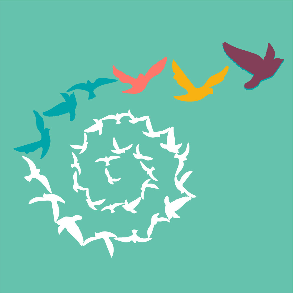
emblem on aquamarine background

emblem on amber background

After the brand assets were completed, I have implemented the brand style on other graphic items such as printed flyers, business cards, invoice and presentation templates using Vinita's soulful shots. The photos made all of the designs come to life. Everything came together in harmony on the website, special thanks to Lisa's creative vision and Moran's suggestions, her guidance on the content creation. We have looked together with Lisa on the website, how we can reflect the brand look on different page layouts and use the elements of the logo to build a playful and pleasurable website to discover. The content on the website was Mags from House of Hives helped out Yvonne with writing and translating the content. last but not the least, I have supported Yvonne to build a visual style on social media creating templates using the brand assets we have in hand, under a few different themes. Now she can create consistency in her posts and be proud of her brand looking outstanding and professional!
It was such a nice journey to work together with you Yvonne and Rebranding Boutique.
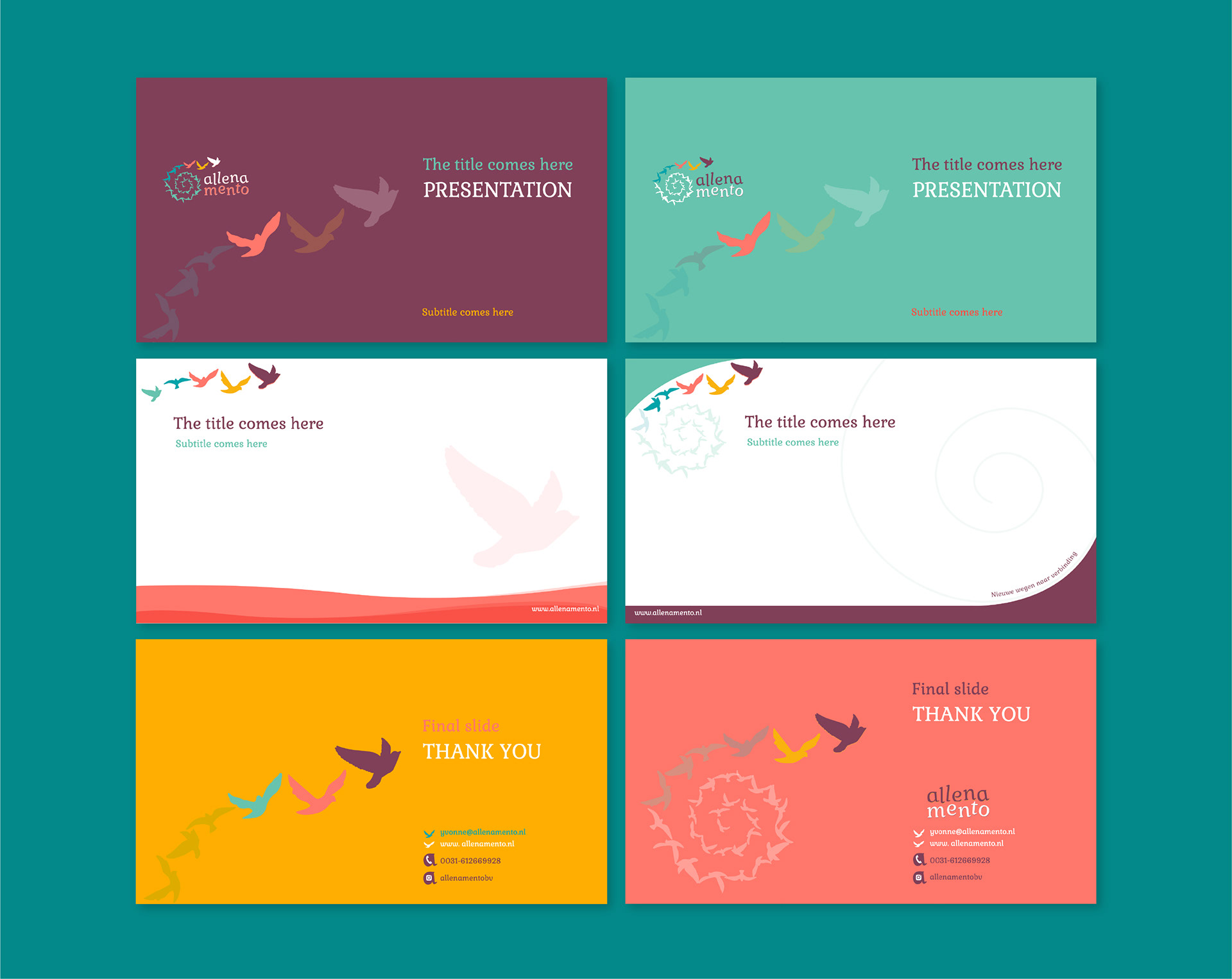
Presentation template for Allenamento
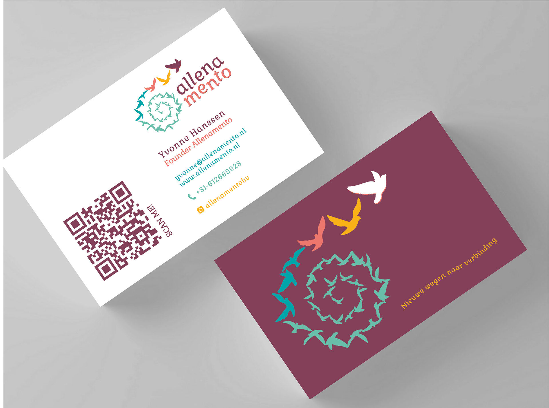
Business card design for Allenamento
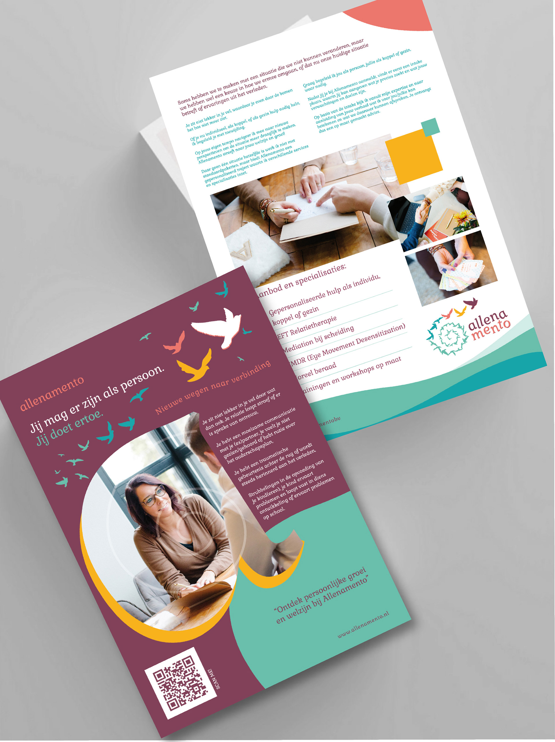
flyer design
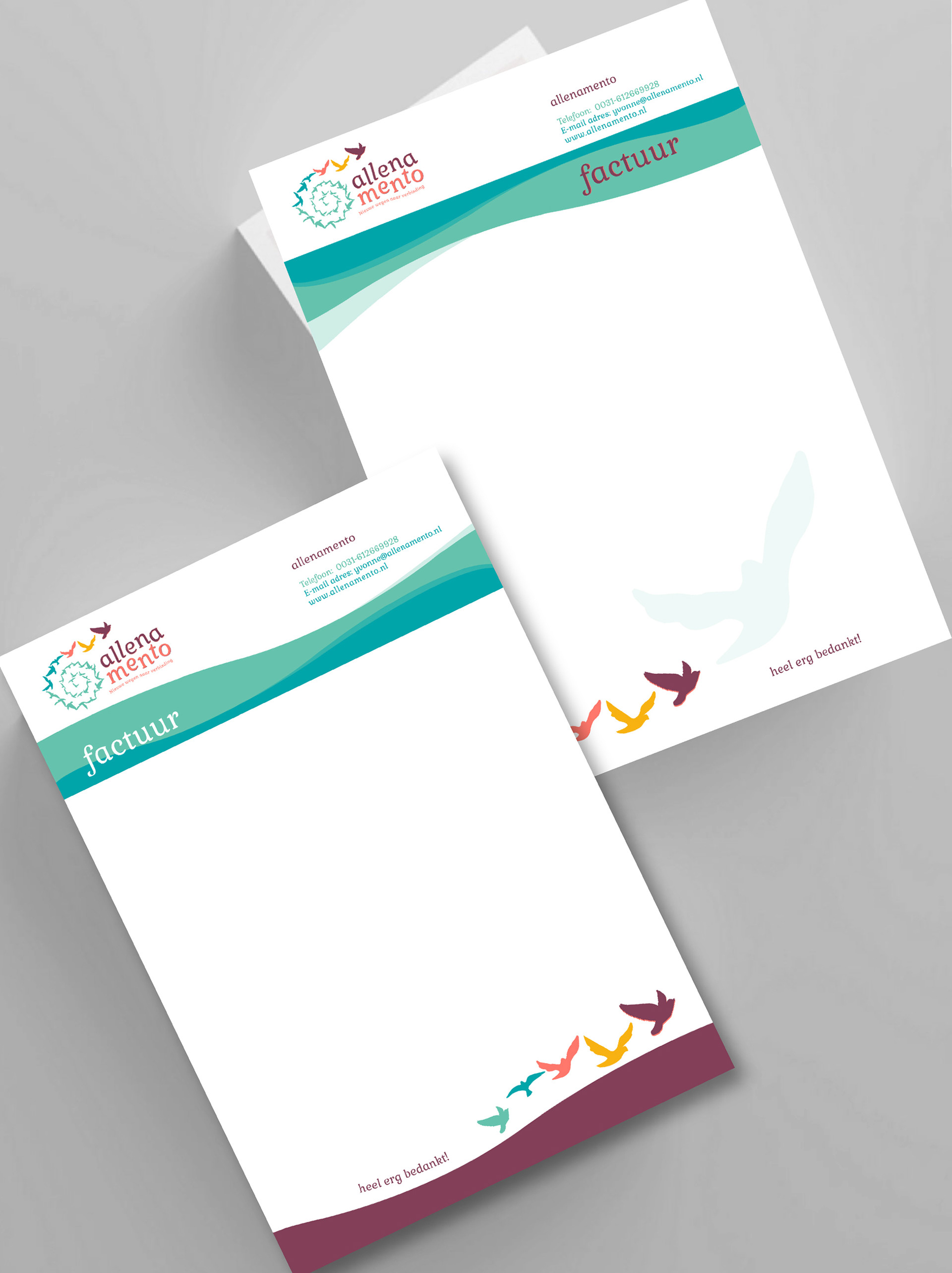
invoice design
A5 flyer design and invoice templates for Allenamento
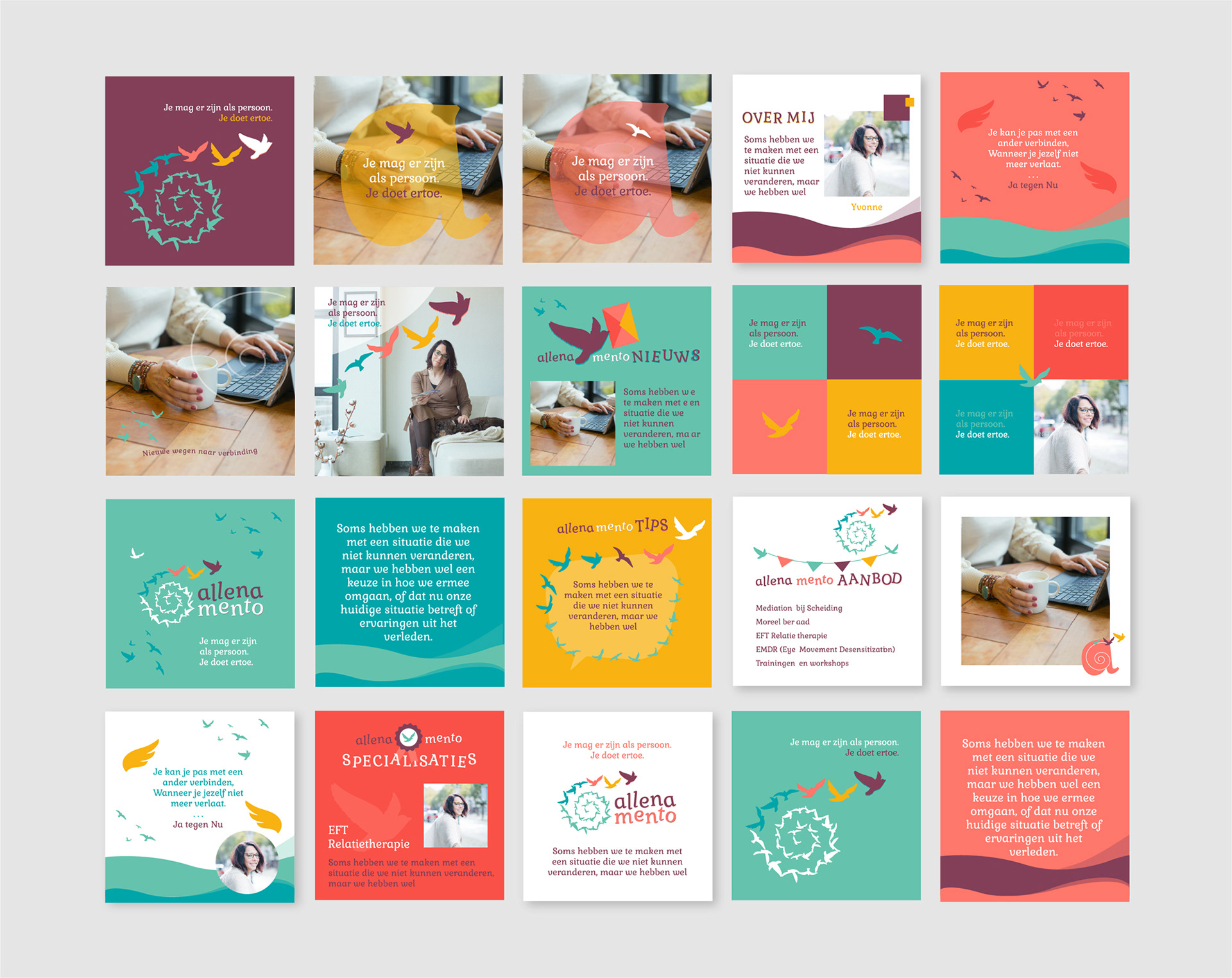
IG templates for Allenamento
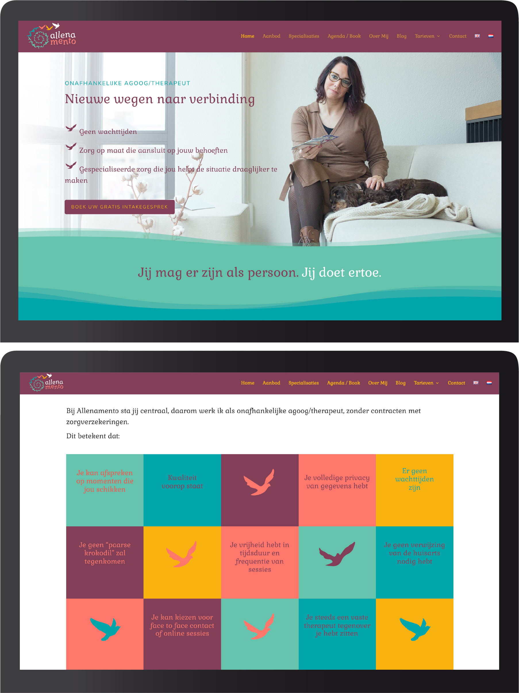
Website design by Rebranding Boutique
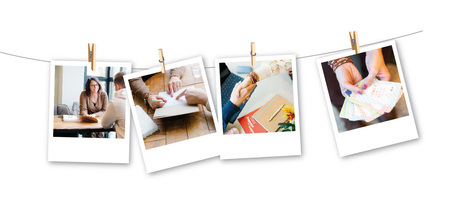
Brand photos taken by Vinita Salomé
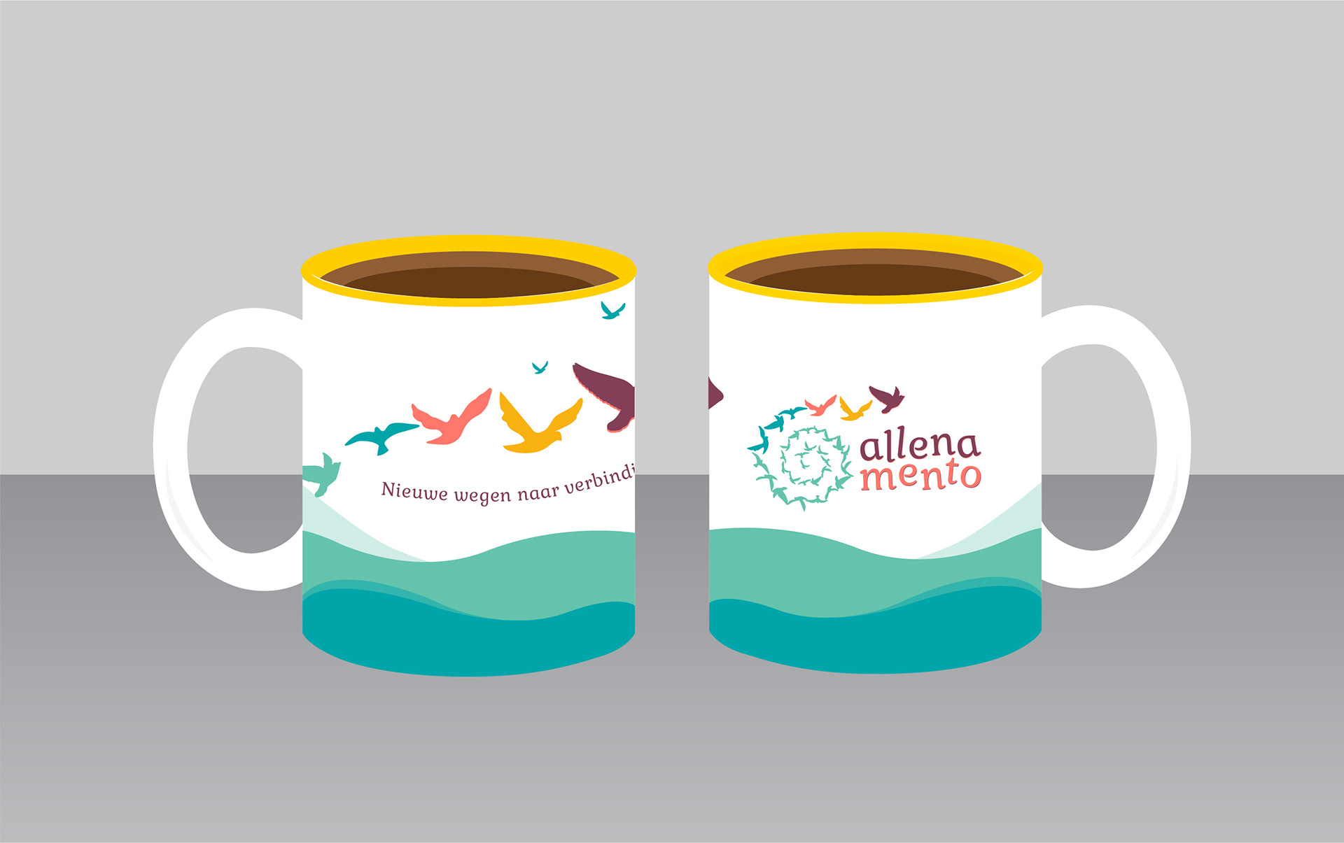
Mug design for Allenamento
What Yvonne Hanssen ✻ Founder of ALLENAMENTO, said:
for Rebranding Boutique: When I look back on these past months, I look back with a very warm and satisfied feeling. I think it is very special how you have been able to express my work, my vision and 'ME' so beautifully.
for Cigdem: How appropriate and touching a beautifully logo and a corporate identity can express something without words. I only now realize that we have not described the beautiful piece of explanation about the logo. 'About letting go and new ways to connection in the words of Cigdem'. I have food for a blog again.