
Client name: Barbara Piper-Roelofs
Our paths crossed with Barbara at the end of 2021 when Lisa Hall of Lemonberry introduced us thinking that we would make a great team creating her new brand for her business 'Be Rooted'. Barbara had already been working with Lisa and Vinita Salomé of Vinita Salomé Photography on her brand photography when I joined the collaboration under Lisa's project management.
Be Rooted had been up and running for several years supporting organisations and young academic professionals to cultivate sustainable skills for personal well-being integrating mind, heart, body and compassionate practices in support of living a fulfilling life. The focus is on a change from the inside out, helping her clients develop skills such as self-awareness, self-compassion, kindness and empathy.
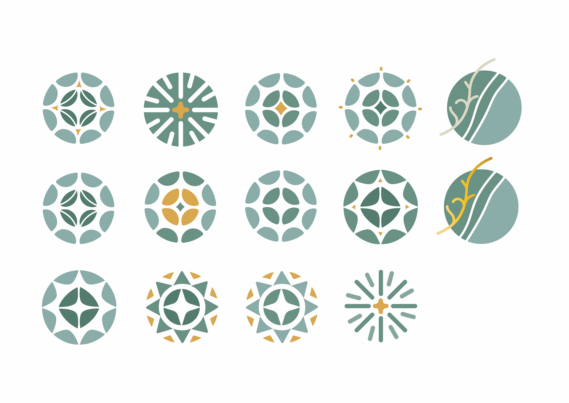
Barbara was at a period of change in her business and she wanted to gain more clarity on which aspects and programs to focus on, re-connecting with her roots, and defining her priorities. We have done several sketching and drawing sessions with Barbara, thinking and brainstorming together to find the right visual that could represent her business for her clients in the best way.
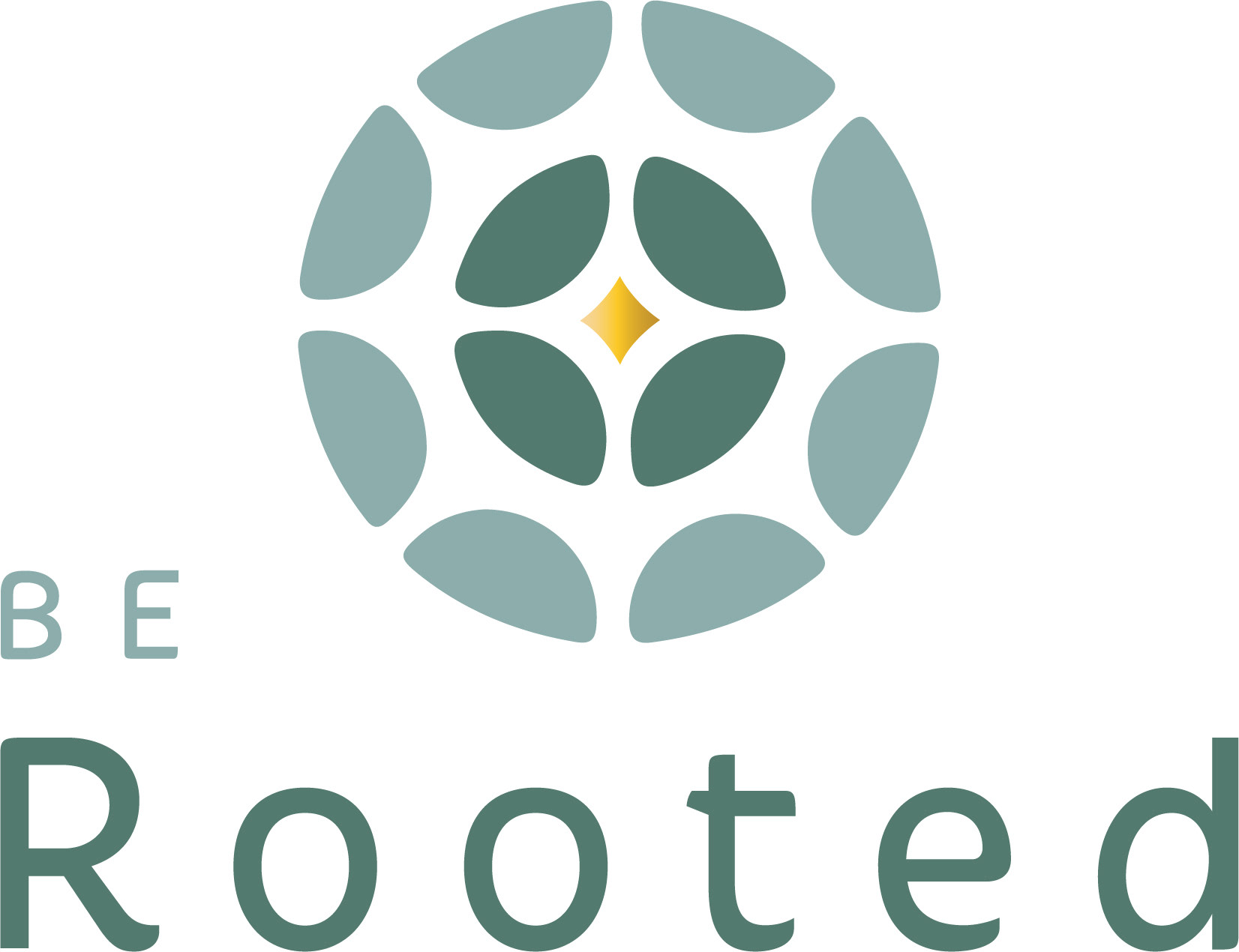
The message Barbara's new brand needed to spread was a calm space, being focused, open, being re-connected to ourselves more deeply and awake gentle, kind feelings. After some discussions we have decided to take an abstract design route and emphasize the systemic change her clients go through after experiencing her programs which happens in stages. This was the reason we have used layers in her branding and a center of attention with the gold diamond where everything starts inside you and gradually spreads and changes the world.
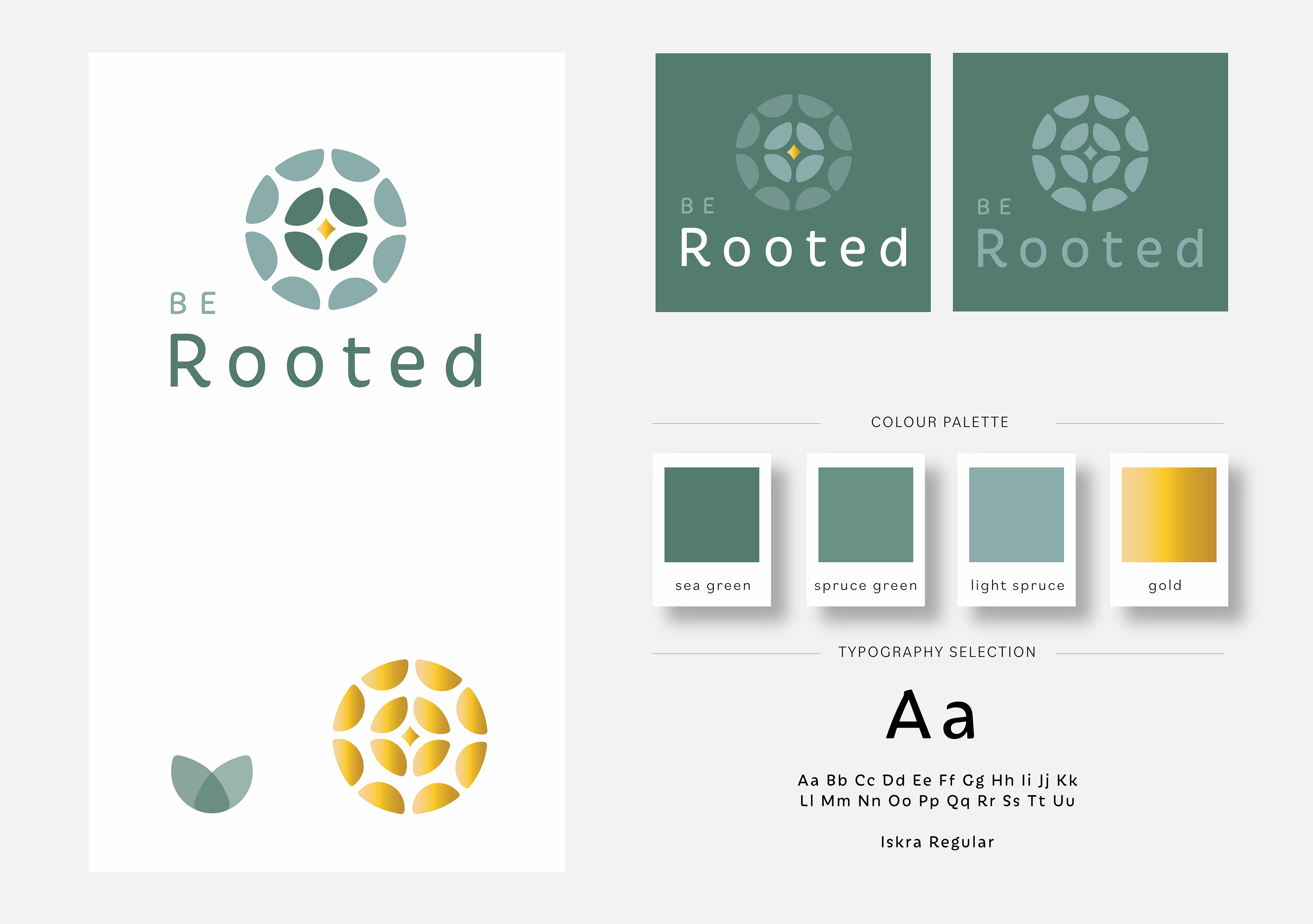
We came up with a calming colour palette where we see tones of sea green, which has a soothing essence and has a relaxing and inspiring effect. It symbolizes revitalization both for her own business and her clients. Gold was an addition to emphasise the diamond. Barbara really liked shimmering tones and I thought gold sparkle would be the right colour to show the value she adds to her services.
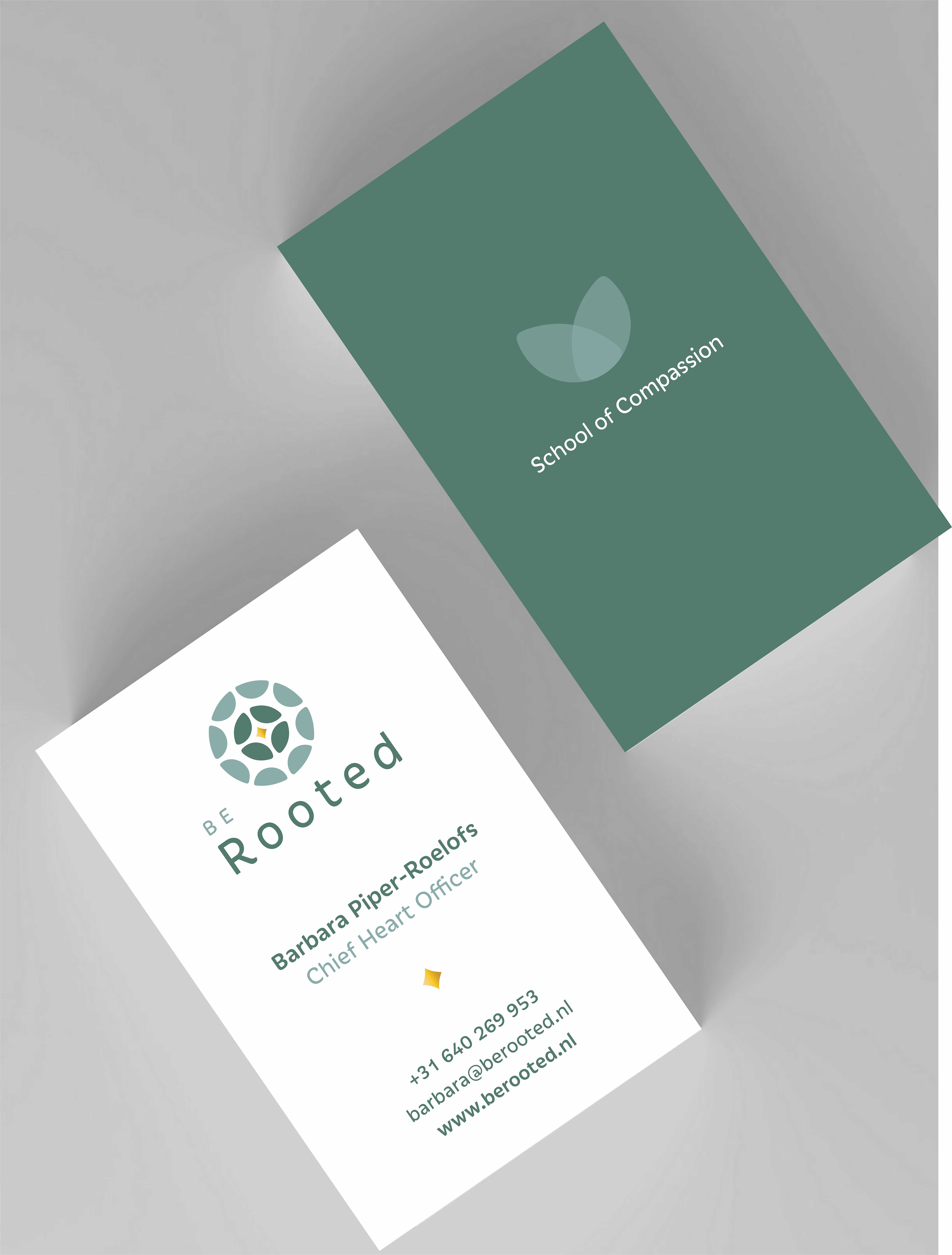
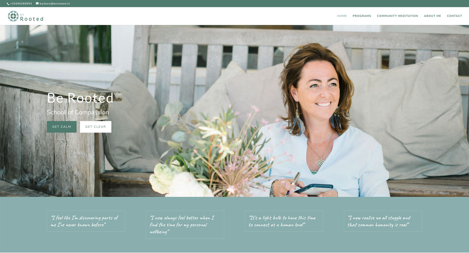
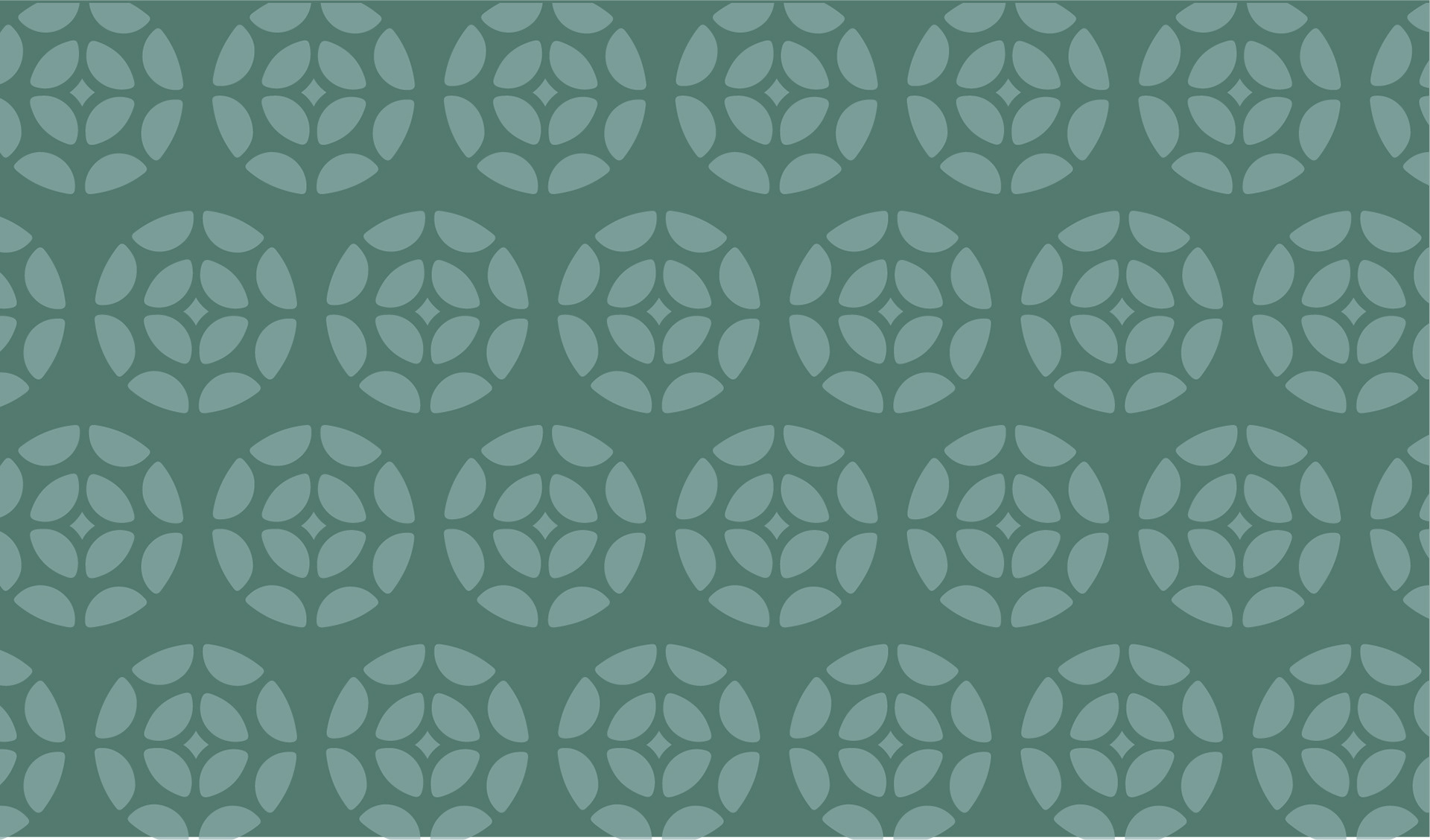
The emblem created is easy to be used in in any format and also within a pattern because of its circular form, and flexible to be adapted to different colour combinations in the palette. Lisa from Lemonberry has created an amazing website using the branding and putting everything together, showcasing Barbara's business right from her heart in combination with Vinita Salomé's stunning photos where she has caught Barbara's energy so successfully! What a great team work it has been.
Website design by Lemonberry
Branding sketches

What Barbara Piper-Roelofs ✻ Founder and Chief Heart Officer of BE ROOTED, said:
The rebranding process for Be Rooted with Crocusfield Creative was thorough and insightful. Cigdem has a very creative mind and once we established the clear message about how Be Rooted supports professionals and what I really wanted to convey, she came up with most amazing brand identity elements. It was a process!!
I love the richness of the new brand. The emblem and the colour palette both symbolising revitalisation as an ongoing transformation, both for my clients as well as in my business. A multilayered logo hinting to a compass, a wheel, the globe, the sun, and the moon and combining them with the ongoing movement of the seasons and of our personal change. With the gold diamond shining in the centre, representing my clients; all change starts inside of you and gradually spreads and changes the world.