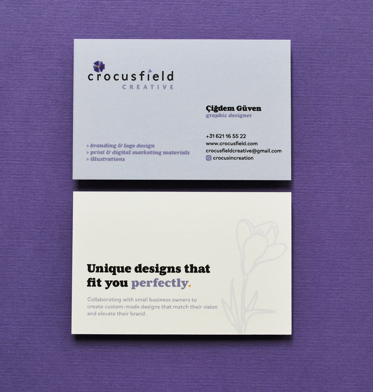
CROCUSFIELD CREATIVE — Brand Identity ✻ 2019
I have decided to work as a solo entrepreneur and set up Crocusfield in the Hague, in February 2019. As I have mentioned in my profile page, my Turkish name 'Cigdem' comes from the crocus flower, a symbol for resilience. I love the fact that this significant flower has been equated with joy and cheerfulness. Because of its blooming in early days of spring, the crocus is also seen by some, as a symbol of hope. Winter will indeed end, spring will come again and life will go on. I always feel full of joy when spring and eventually summer time comes.

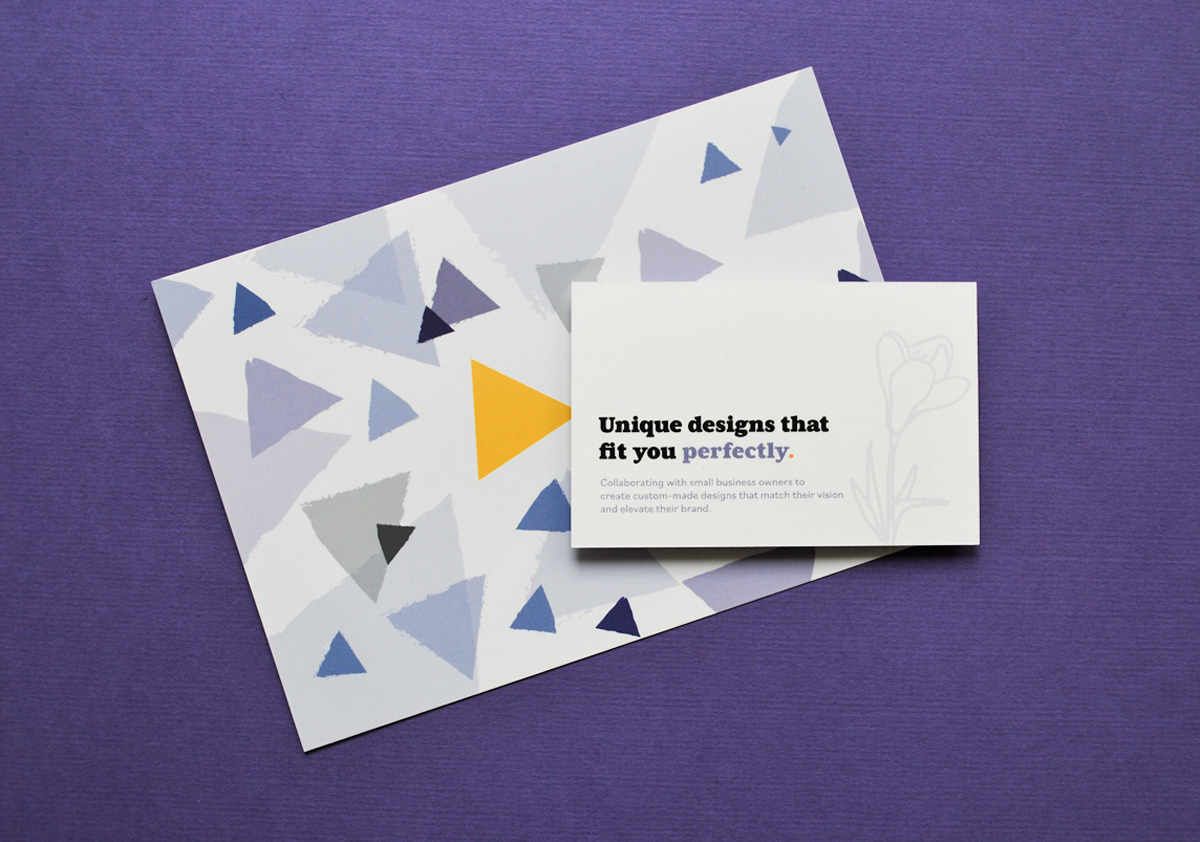
When it was time to create a brand for my business, I knew that I must incorporate this beautiful, meaningful flower to my logo. Crocusfield brand is an exploration of design using the bright colour palette of the original flower, lilacs, lavender and yellow accompanied with with black & cream. I wanted the logo to be fresh, minimalist and playful. Crocusfield has a delicate, caring and a creative personality and I believe those values match with my simple and geometric flower and the stem underneath associating the crocus to the logotype.