
EXACTLY EDITING — Brand identity ✻ 2025
Client name: Rebecca Blunden
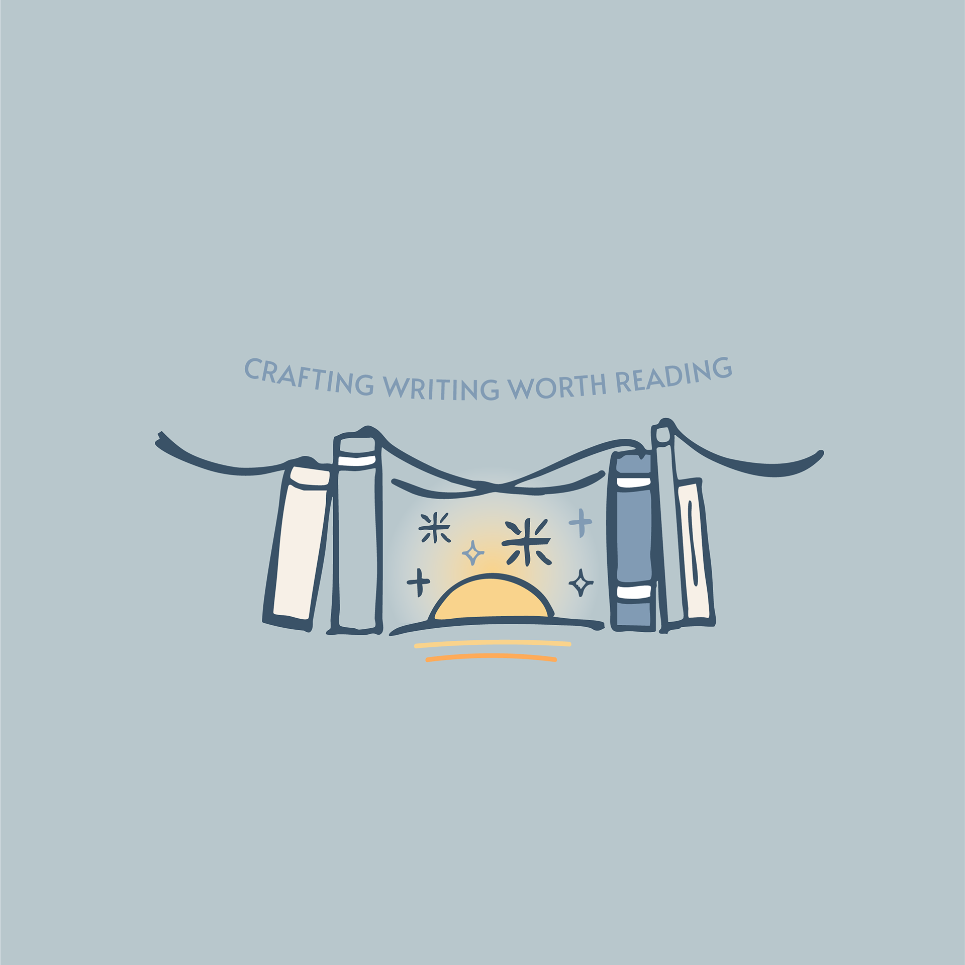
One of my recent branding projects was creating a new logo for Exactly Editing. At Exactly Editing, Rebecca Blunden produces writing that others want to read. CRAFTING WRITING WORTH READING is the tagline that goes along with the brand.
Rebecca works together with creative writers, academics, self-publishers, technical professionals and commercial clients offering both creative and procedural editing services. Rebecca is a full-time freelance editor who is obsessed with language and written word.
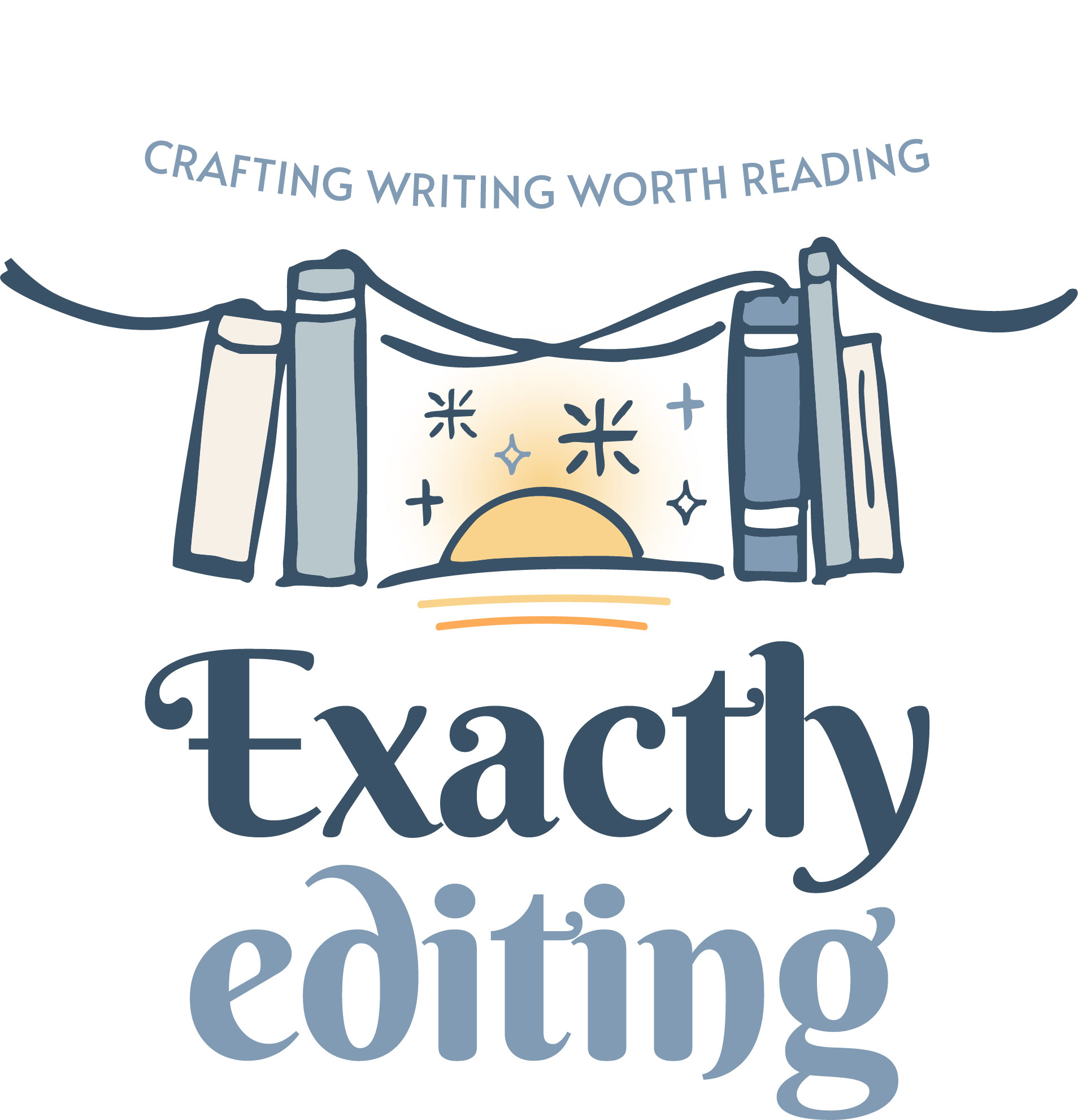
Her business needed a brand new look and her website was in the process of being updated. Rebecca was keen on using the book graphic that symbolises the act of reading in her branding. Also was into having a neutral colour palette: preferably white, cream, light-mid blues, greens, lighter earthy tones.
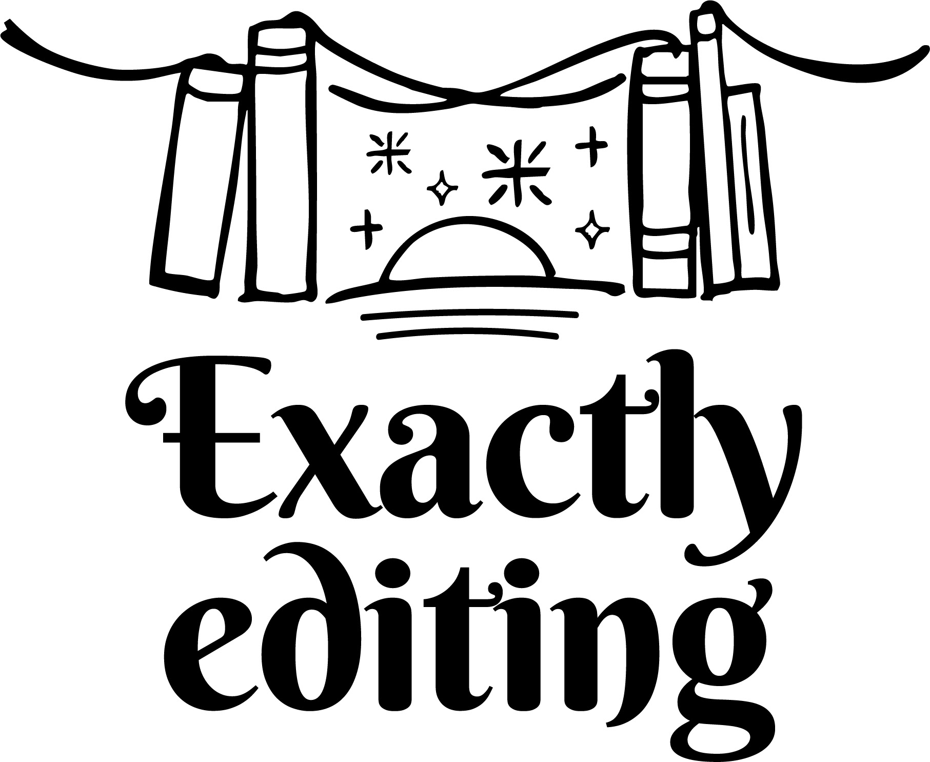
Services being offered by Exactly Editing being the bridge between the authors and the readers inspired me to come up with the concept of books providing struts for the bridges. I have gone for smoky- cool blues, taupe, accompanied with warm apricot and sunshine colours that lift the whole design up.
The sunrise theme represents the happy reader and creative ideas arising. The sparkles stand for the creative thoughts and ideas that help Rebecca to do her magic! We have gone for the hand-drawn line drawing style to make the logo look welcoming and friendly.
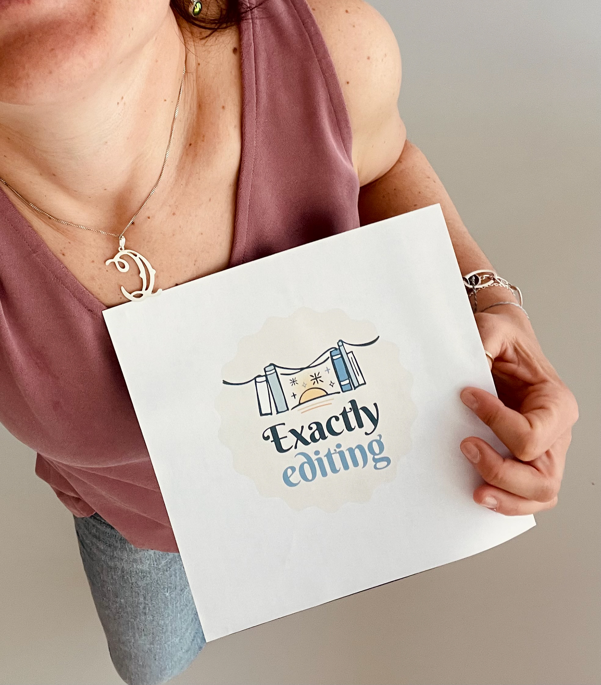
Rebecca is very pleased with the new logo we have created. It was such a pleasure to work together with her in this small project. Teamwork makes the dream work, as always!
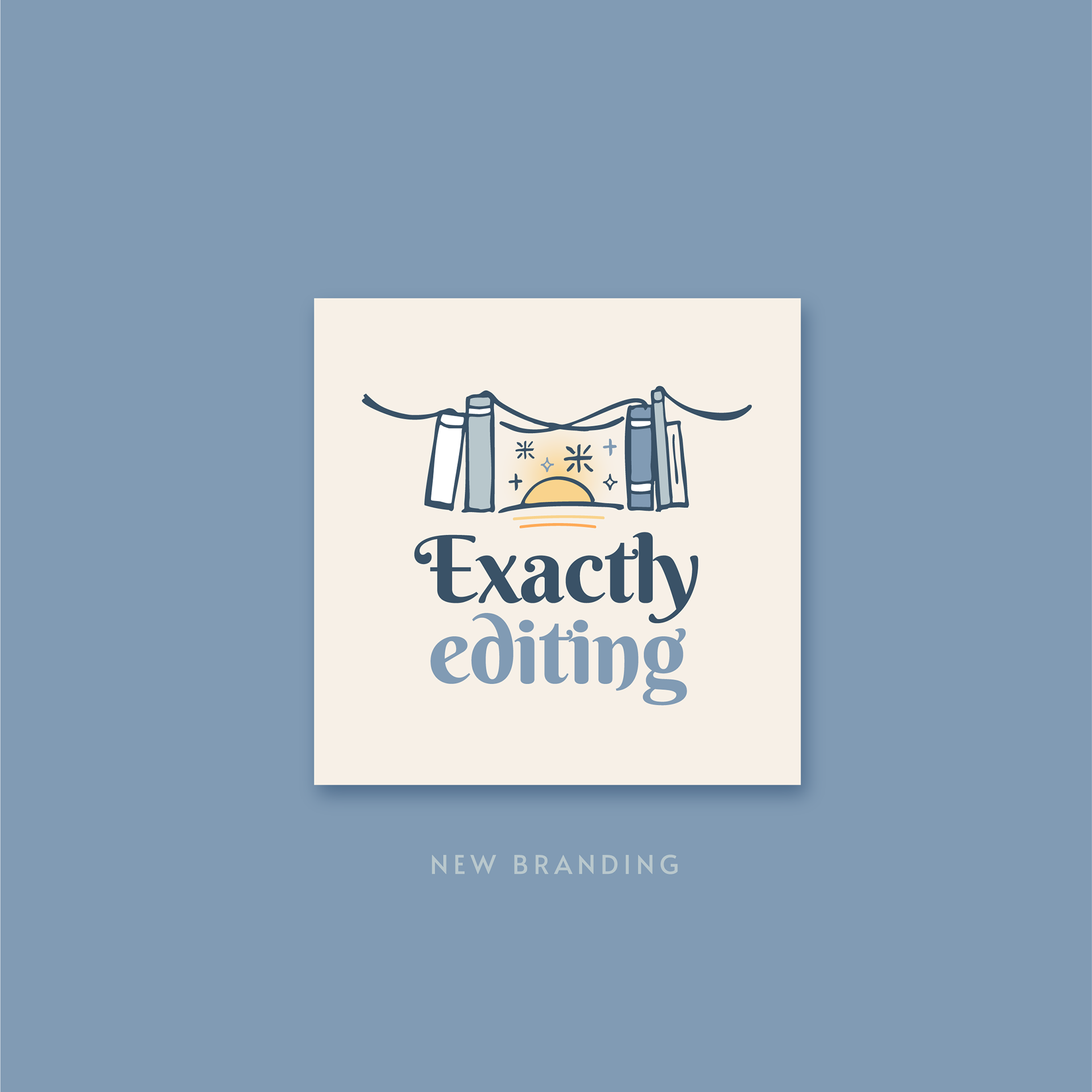
Logo design with books, bridge and sunrise in smoky blue tones and yellow, created for Exactly Editing.
Emblem design with books, bridge and sunrise in smoky blue tones and yellow, created for Exactly Editing.

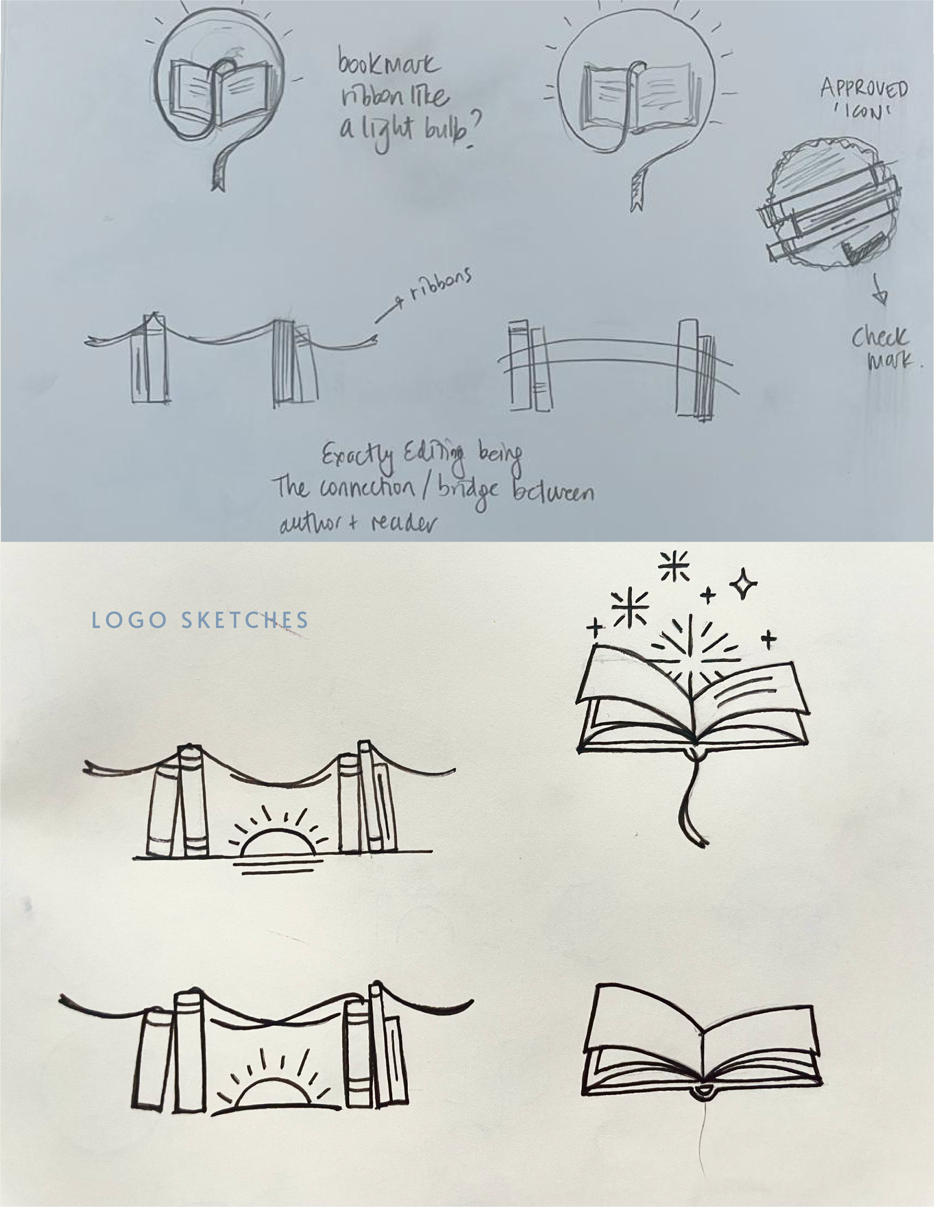
Initial hand-drawn sketches for the logo concept of Exactly Editing.
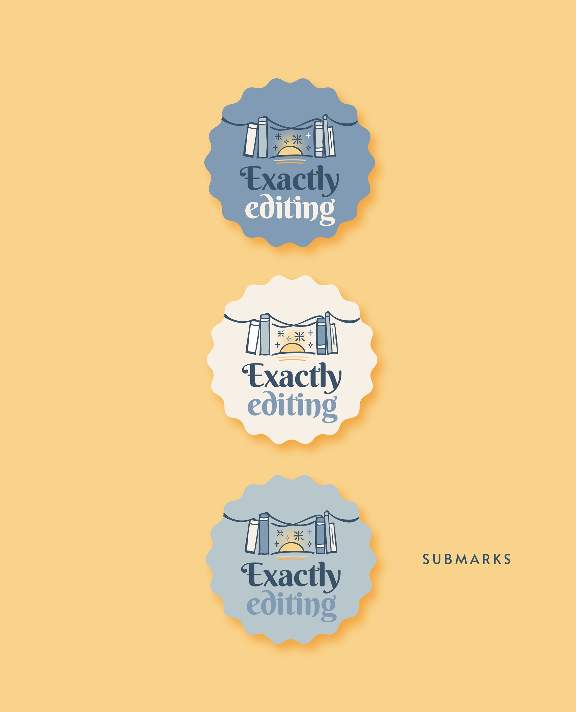
Multi-coloured submarks in seal stamp form created for Exactly Editing.
Initial hand drawn sketches for the logo & submarks
What Rebecca Blunden ✻ Founder of EXACTLY EDITING, said:
Cigdem recently designed a new logo for my small editing business and put together a gorgeous mini style guide with a range of styles to use on my new website and more…
Cigdem is lovely to work with. She really listened to what my work and me are all about and immediately came up with some great ideas! She is very organized, professional and friendly to work with. I was grateful for her warmth and patience as I was making my choices.
The result of her work is a unique logo and I especially love that it is based on her hand drawn design! She has created a true depiction of how I edit - as a bridge between author and reader, all while letting the sparks of ideas fly between us. She also nudged me gently towards trying out some new, warmer colours…
I will happily work with Cigdem again in future and highly recommend her process and designs!
Thank you Cigdem for giving my branding meaning!