LITTLE ENGLISH LIBRARY — Brand Identity ✻ 2024
Client name: Moran Greenwald
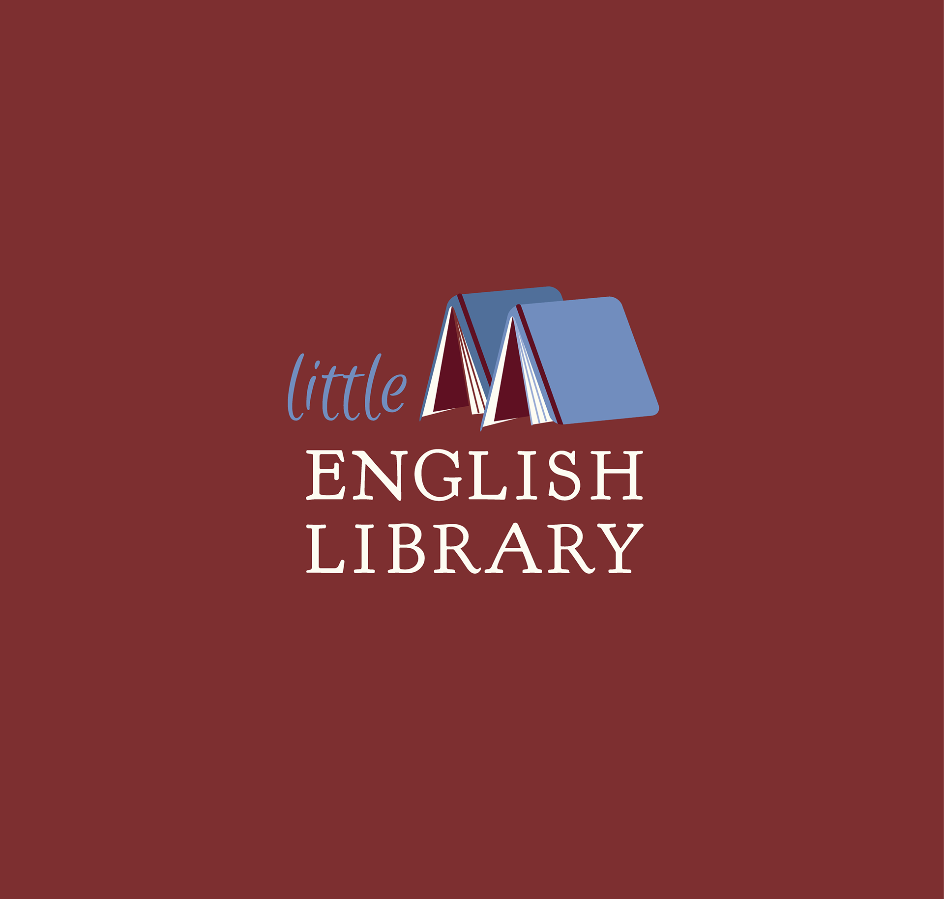
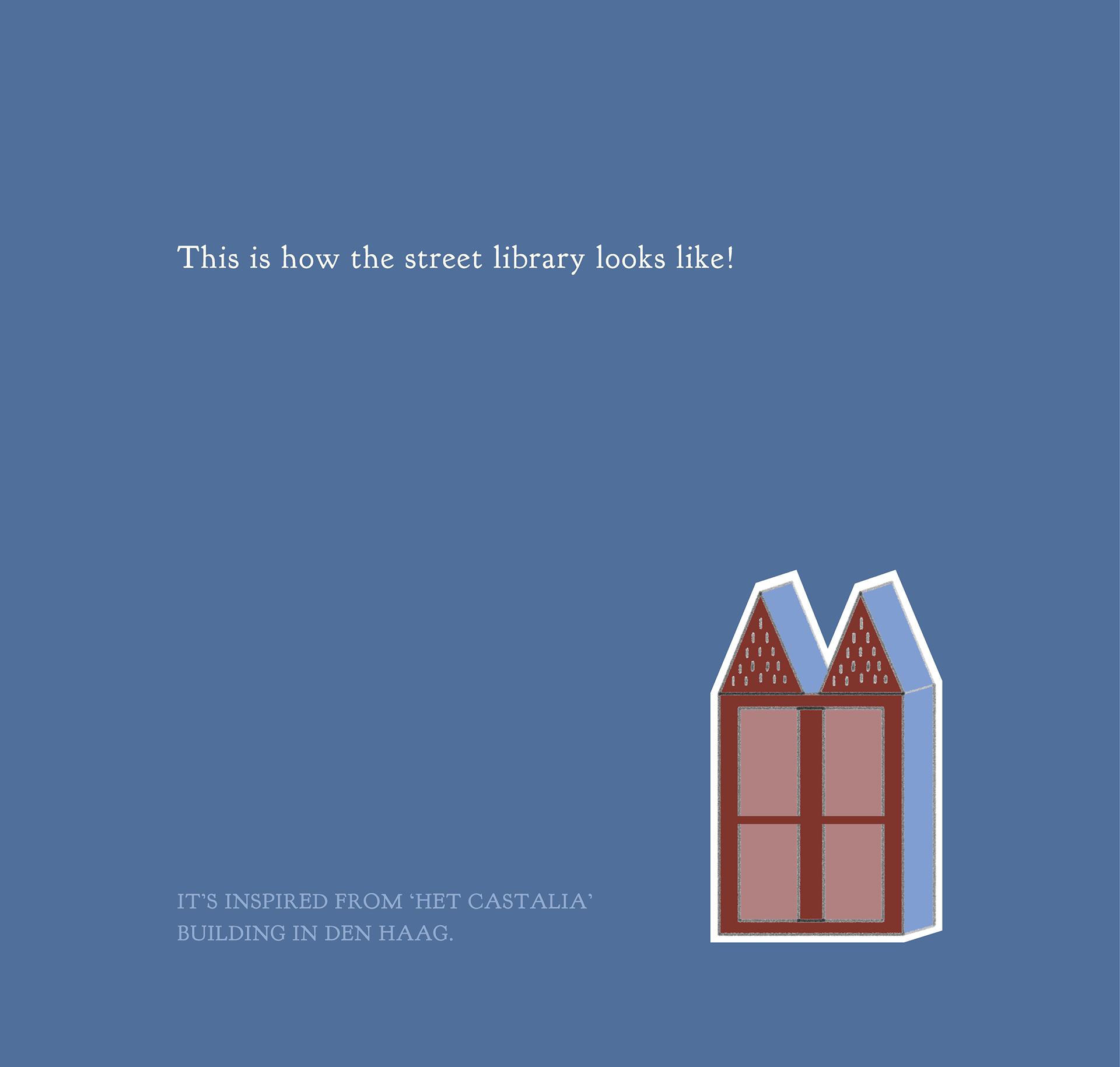
Not long ago, I had the opportunity to let the creative juices flow for the brand design of a special private project. The project owner Moran Greenwald is my friend whom I collaborate often with on rebranding projects. The project is called 'LITTLE ENGLISH LIBRARY'. This initiative was for a free street library, a little home for English books, soon to be located in a neighbourhood in The Hague: with its distinctive structure inspired from the famous Het Castalia building that has pointed roofs.
In the logo I created I tried to imitate the form of the structure using books standing open on a flat surface. The colours of the actual library and the logo are reflecting a similar palette to the building's.
The idea of the library is to share the pleasure of reading with like-minded people and create a community who likes enjoying and exchanging English books. I look forward to seeing this library coming to life!
Hand-drawn sketches for Little English Library logo design
Stamp design


The library is inspired from 'Het Castalia' building in Den Haag.
What Moran Greenwald ✻ Initiator of LITTLE ENGLISH LIBRARY, said:
Cigdem at Crocusfield did a fantastic job creating the logo for my Little English Library, a project I was very passionate about. She quickly understood the vibe I wanted and delivered designs that perfectly matched the spirit of the project. Her attentive approach and quick turnaround made the whole process smooth and enjoyable. I highly recommend her for thoughtful and tailored graphic design work!
