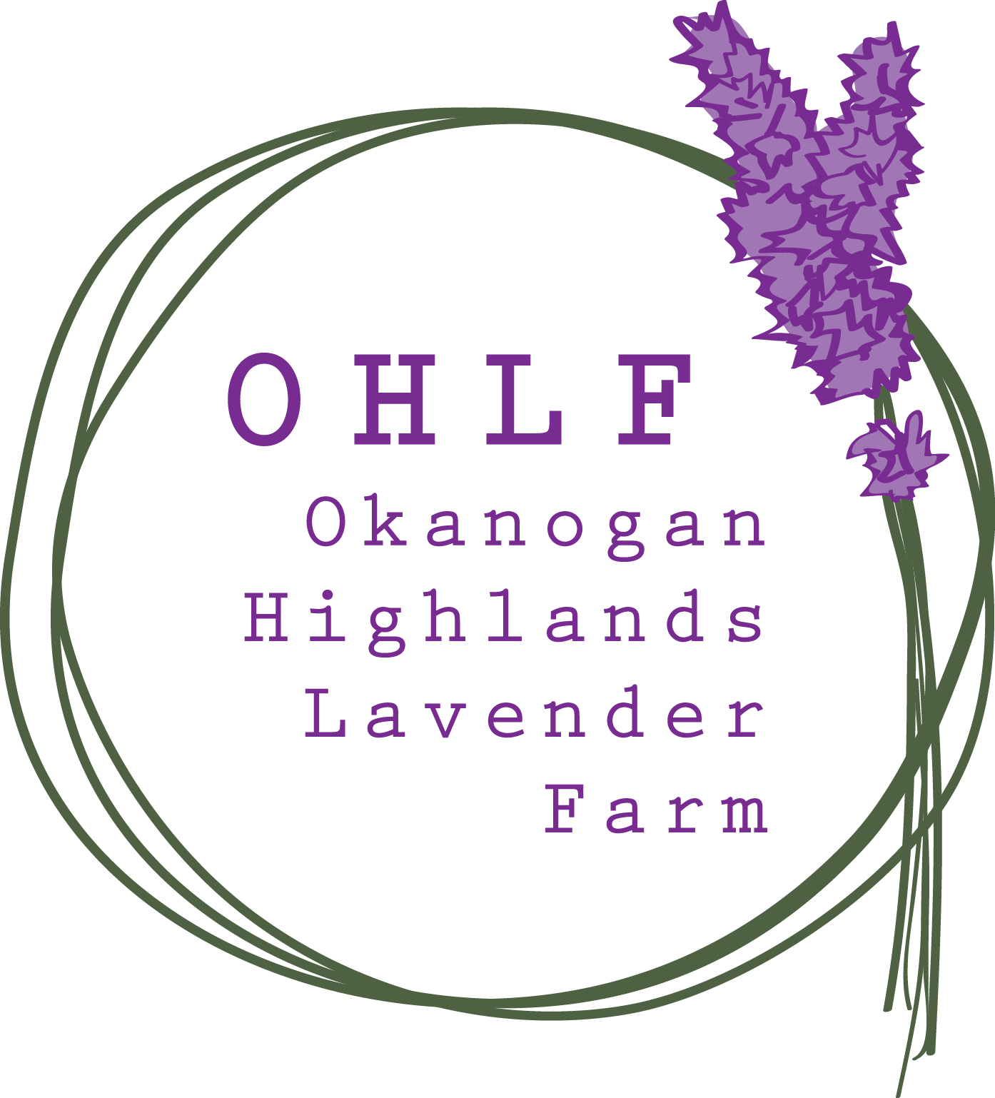
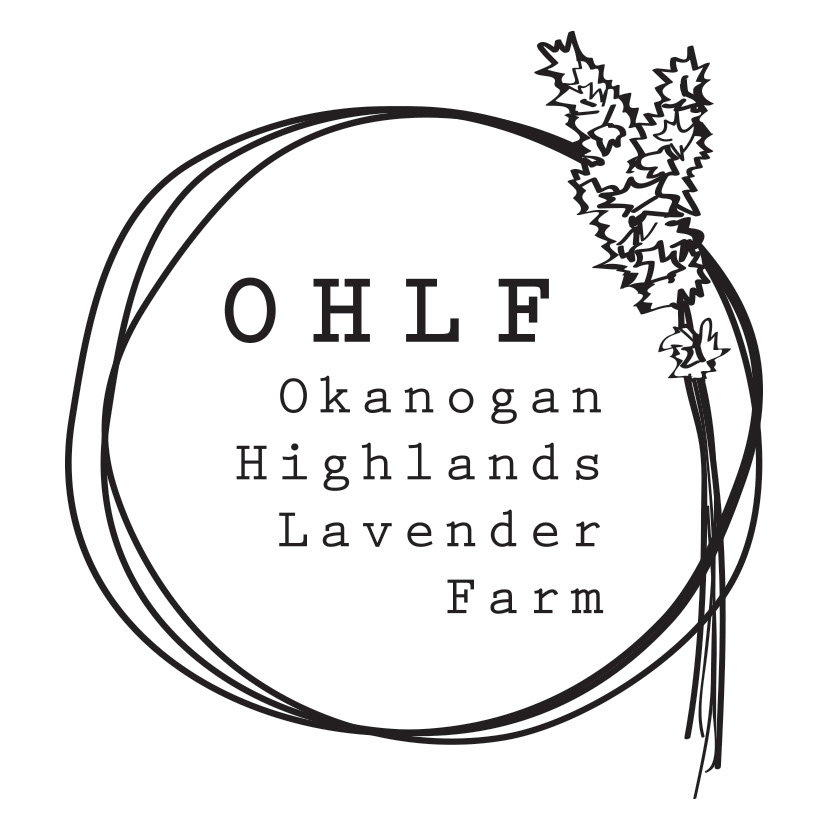
OHLF, OKANOGAN HIGHLANDS LAVENDER FARM — Brand Identity ✻ 2017
Client name: Ana Sneeringer
I have met Ana via The British School when she was in need of a brand identity for her family's lavender farm in the USA. I must say that this project excited me a lot after seeing the fascinating purple lavender fields of theirs... The successful branding that she was searching for was the one telling their own unique story to their customers that will influence and touch their emotions – simple and romantic of course. Our intention was to share the beauty and healing energy of the farm to a wider audience.
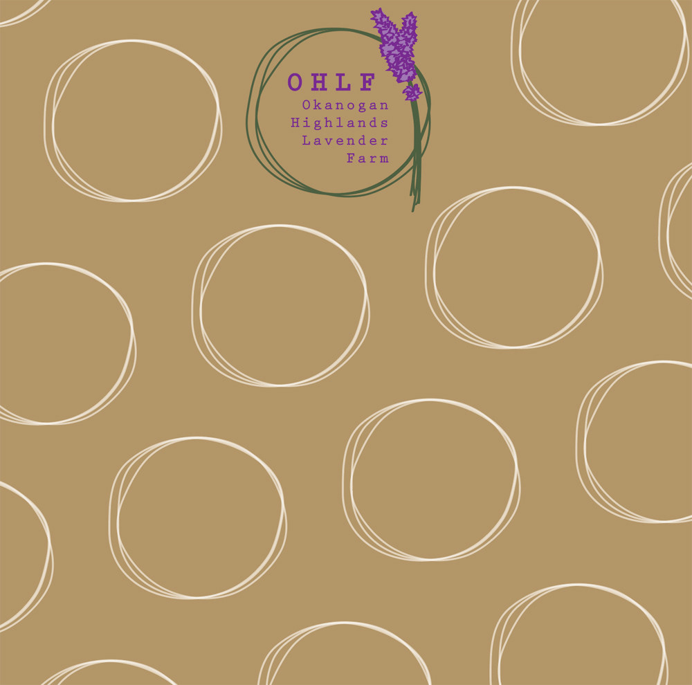
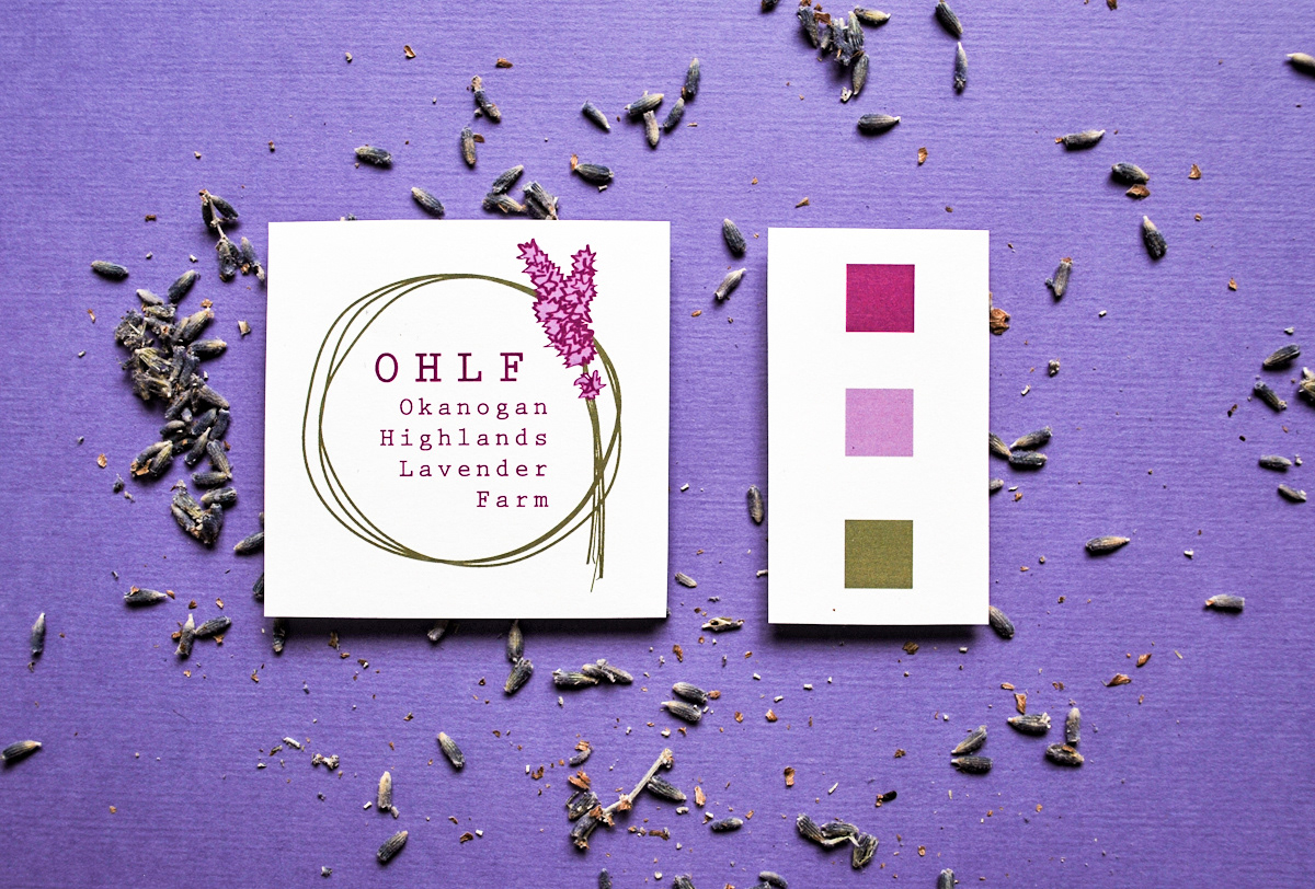
We have gone for a muted colour palette, soft and calming with lavender and tones of fern green. She was keen on using eco friendly paper and materials on her packaging in-line with their motto's. I have drawn the lavenders and circular forms on the logo by hand highlighting the importance of elbow grease that is needed to run such a big farm!
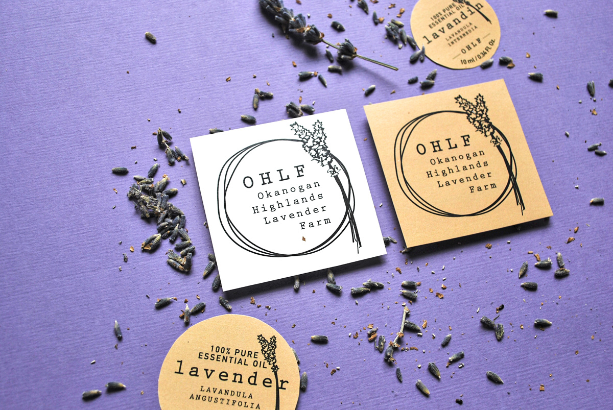
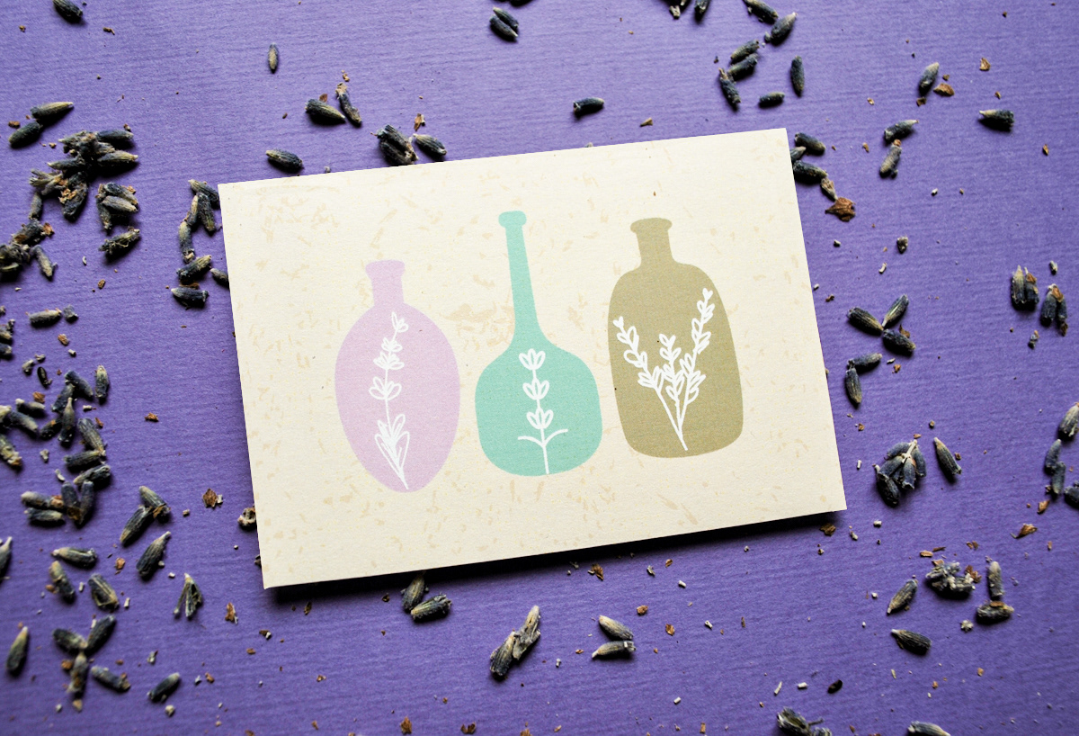
I have done lots of sketches and executed various packaging ideas for the lovely, OHLF lavender products containing natural ingredients .