
PARENTS are PEOPLE too — Brand Identity ✻ 2022
Client names: Anke Fischer & Julia Close
Together with Lisa Hall of Lemonberry and Moran of Data for a Change, I know Julia from the Women's Business Initiative International, as we have all volunteered for the communications team. She had been collaborating with Anke for some time and both being certified professional coaches, finally they have decided to set up this community called "Parents are People too". They are focusing on online group courses and 1-1 coaching that are intensive, yet personal and believe in the power of sharing your story. Julia & Anke help parents feel human again making you realise that you are not the only person facing the same challenges.
For this new collaboration, they were looking for a new brand and website design so it was a team work of me on the branding, Lisa on the web design & development and Moran on helping their business to be more visible online.
For this new collaboration, they were looking for a new brand and website design so it was a team work of me on the branding, Lisa on the web design & development and Moran on helping their business to be more visible online.
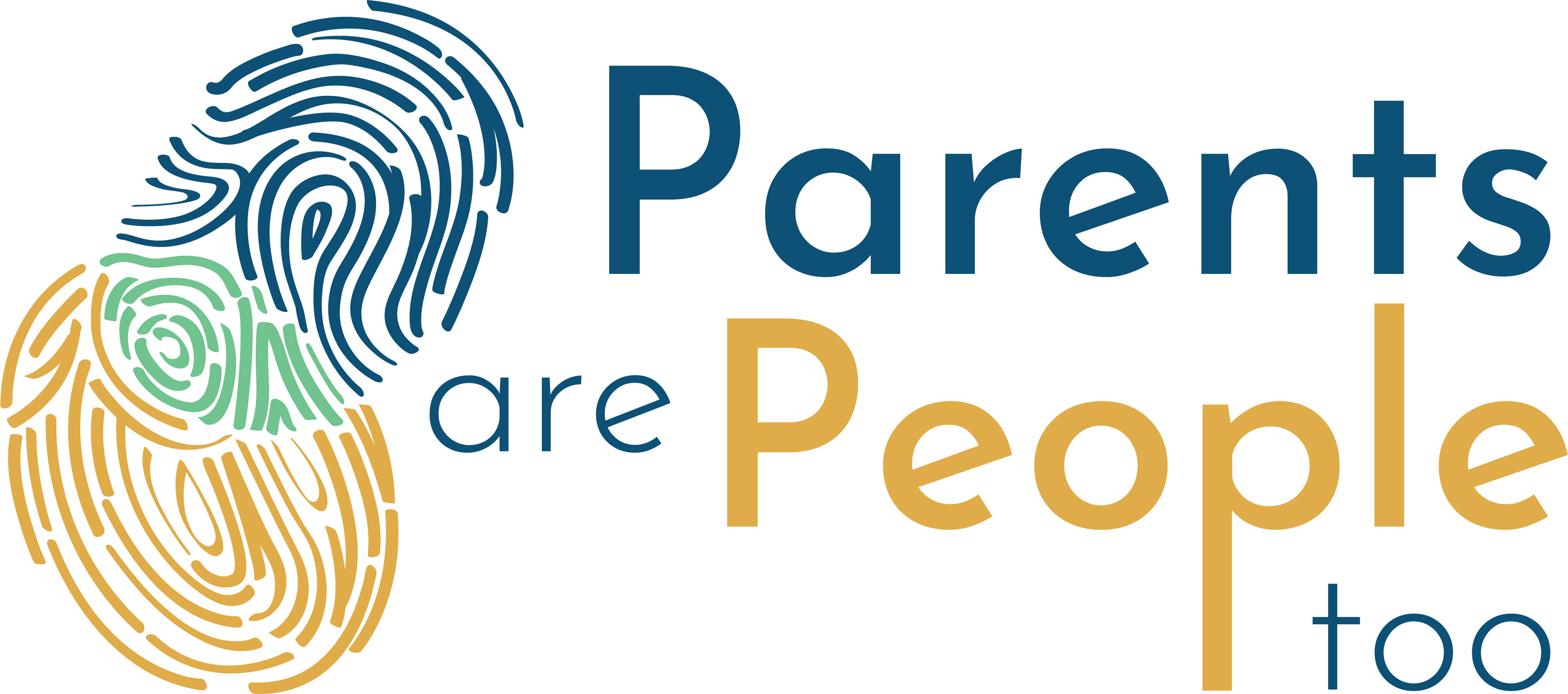
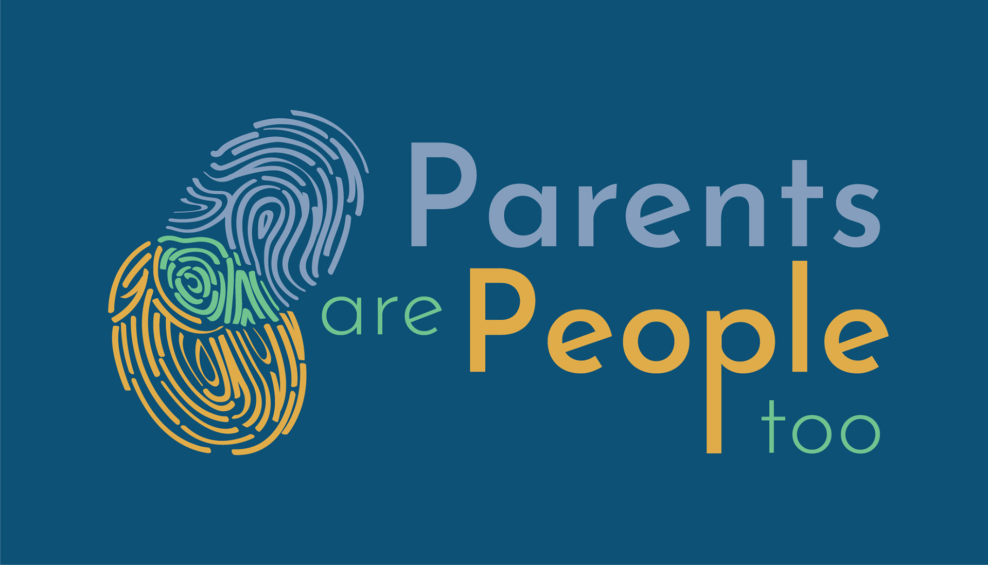
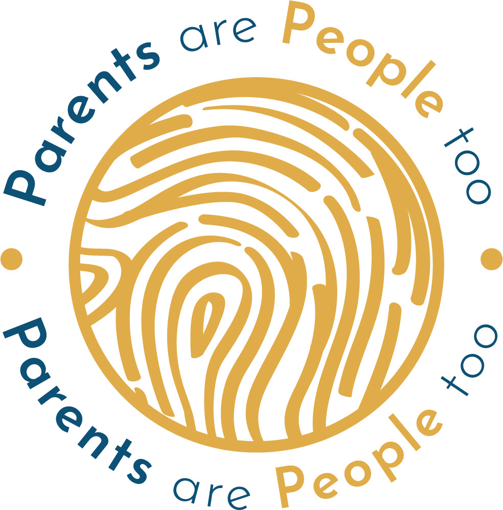
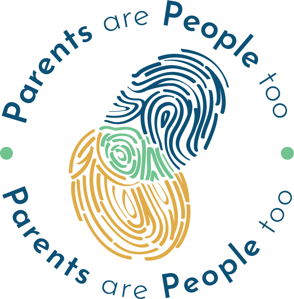
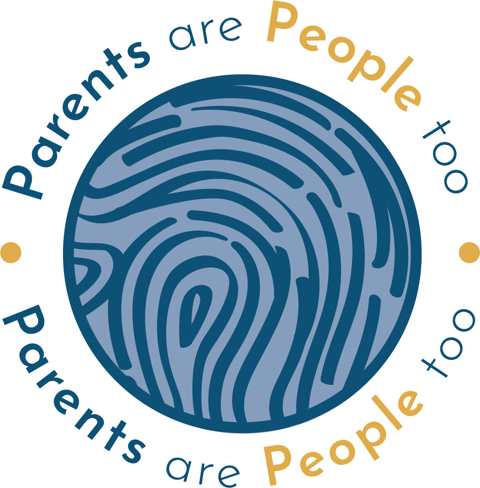
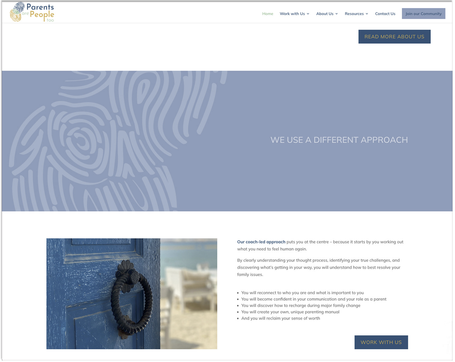
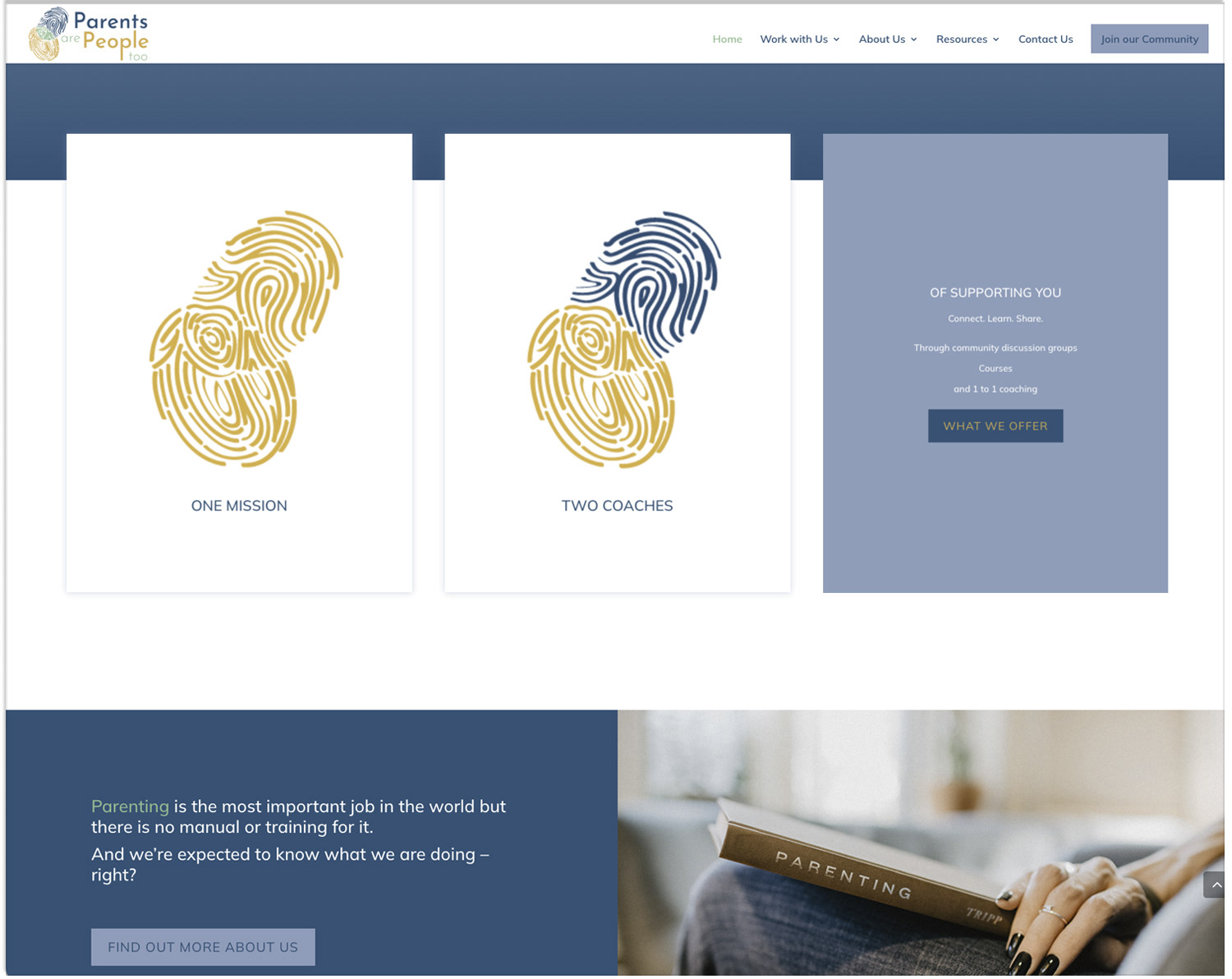
After having several brainstorming sessions, I have headed towards a logo concept that consists of two intersecting fingerprints. The prints are in yellow and blue with the area of intersection representing the collaboration, being highlighted in green.
What makes this business UNIQUE is Julia & Anke. Two entrepreneurs joining their forces, adding value to each other’s work and experience, and having common values and vision to make this business work. PAPT coaching and support community lets you reclaim a true sense of YOU, discover your own identity as a person. We all have different identities in our lives, as a business-women or a businessman, as a parent, as a partner etc. Through Julia & Anke's coaching and support, we learn how to make those identities of ours work in harmony with each other. Because of these reasons, using fingerprints for the intersecting shapes fit very well in my head with this concept.
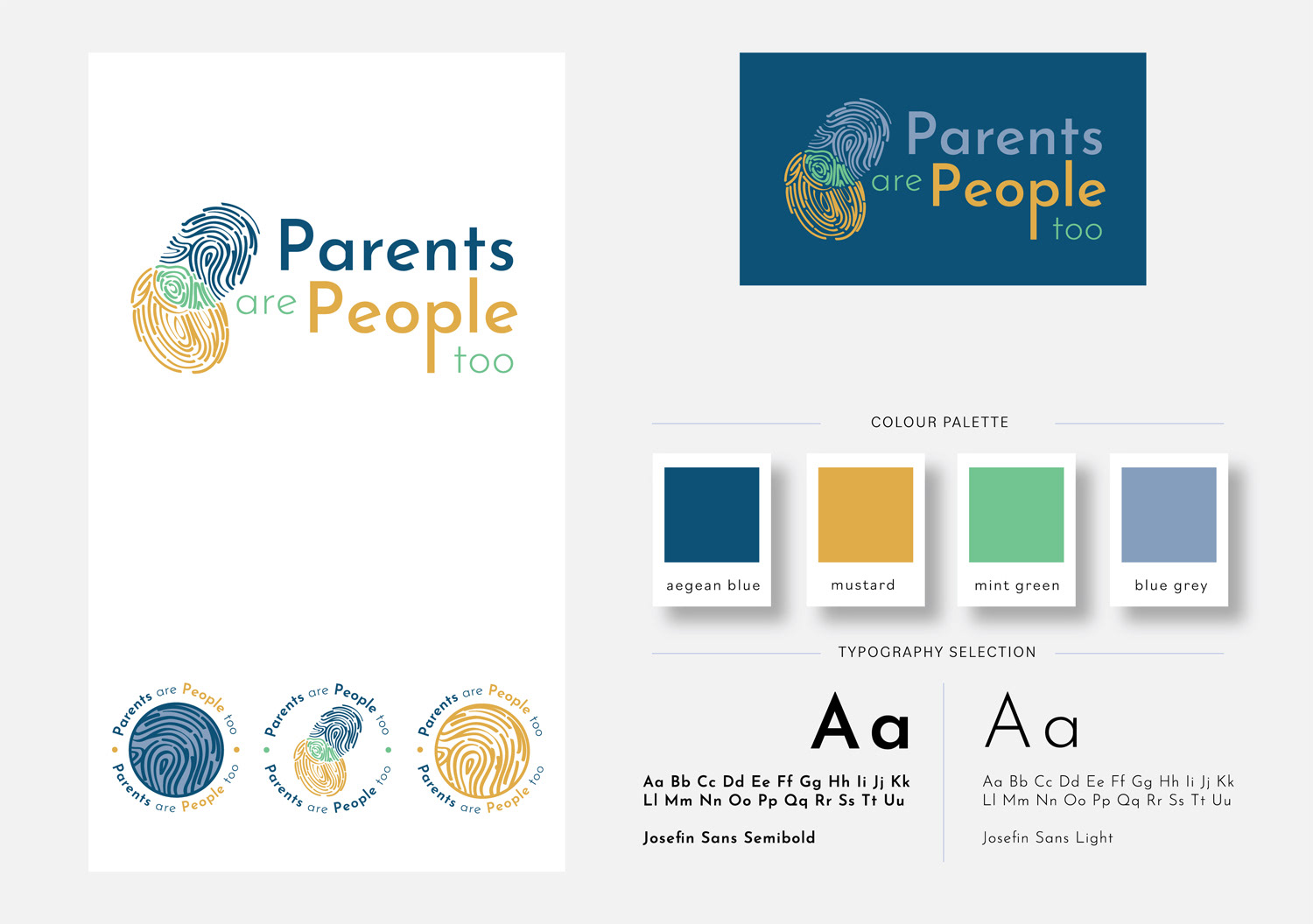
PAPT is a ‘feel good’ community, where you would feel inspired and also have fun! I tried to make sure the forms and the colours I have used give that sense of feeling too. It is a happy and safe environment. The aim was also to see a sense of direction and improvement, growth, dynamism and upwards movement in the logo.

We have met every two weeks with the team during the project and every one of us were updated on each step of the process making sure the branding, the site architecture and the layout design of the site were in-line with each other in answering Julia & Anke's needs. Lisa & Moran made the content planning of the site and guided our content writer along the way, making sure the website works well and is visible to PAPT's visitors. Thank you for the amazing team work!
Website design by Lemonberry
What Anke Fischer & Julia Close ✻ Co-Founders of PARENTS ARE PEOPLE TOO, said:
We love our new website! And we have gotten lots of great feedback about it - which is wonderful as this is our business card as well as our “credibility passport” and our resource center for our clients.
Getting there seemed a bit like building a house - before you start laying the foundation you have no idea that there are so many pieces that need to be in place before you can start decorating!
The team has a great division of labor, they complement each other in how they work and you can tell that they enjoy what they’re doing. The perfect balance of creativity, analytics, and skill!
We loved working with an international team - it was a perfect match for who we are. You did not only help us with creating our website but through your process you reinforced for us who we are as a coaching team!
Thank you - we are proud to go full steam now to change how parents feel - one person at a time!