
PING FORM ART & JEWELLERY — Brand Identity ✻ 2020
Client name: Ping An Brouwers
Even though I had to give a short break due to the pandemic, I have been spending my Tuesday afternoons in Ping's jewellery studio in Den Haag, working on my silversmithing creations. He is such a patient instructor, always full of positive energy... Last year, Ping has asked me to visualise an idea he had in mind for his own brand. Taking his drawings a starting point, I have created an identity for him, reflecting his balanced and zen personality, his unique creative touch, and aesthetic approach. Handwritten 'form' is expressing his friendly, flexible and approachable style plus his personal touch. Whereas 'ping' with the ring form represents balance, precision and attention to detail in his work.
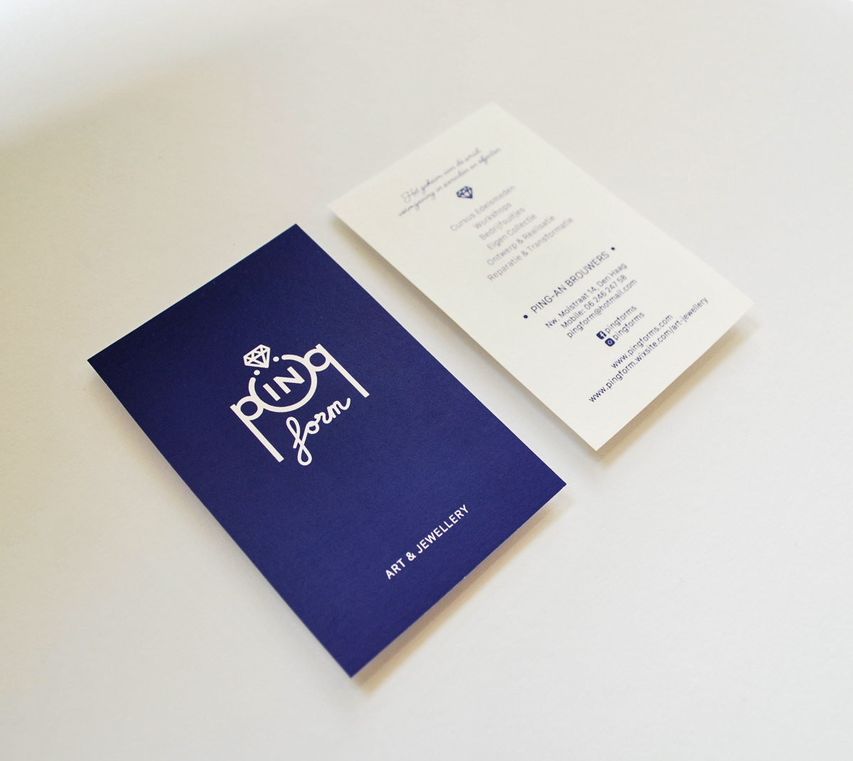
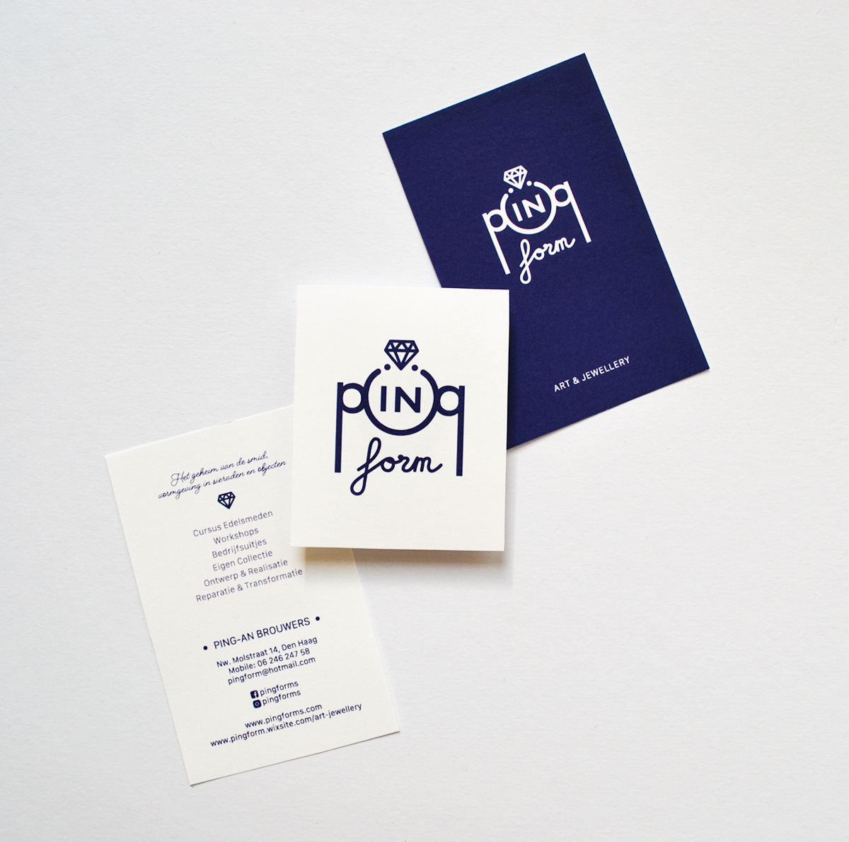
Ping was thinking that navy colour represents him and his business, the best. I have also worked on a presentable business card for him using his new logo design. We are busy now on designing a printable flyer for him, to help him promote his silver and goldsmithing courses to new potential students. Ping is nowadays more active on social media. Once his product photos are ready, he will be sharing his flyer on those platforms as well.
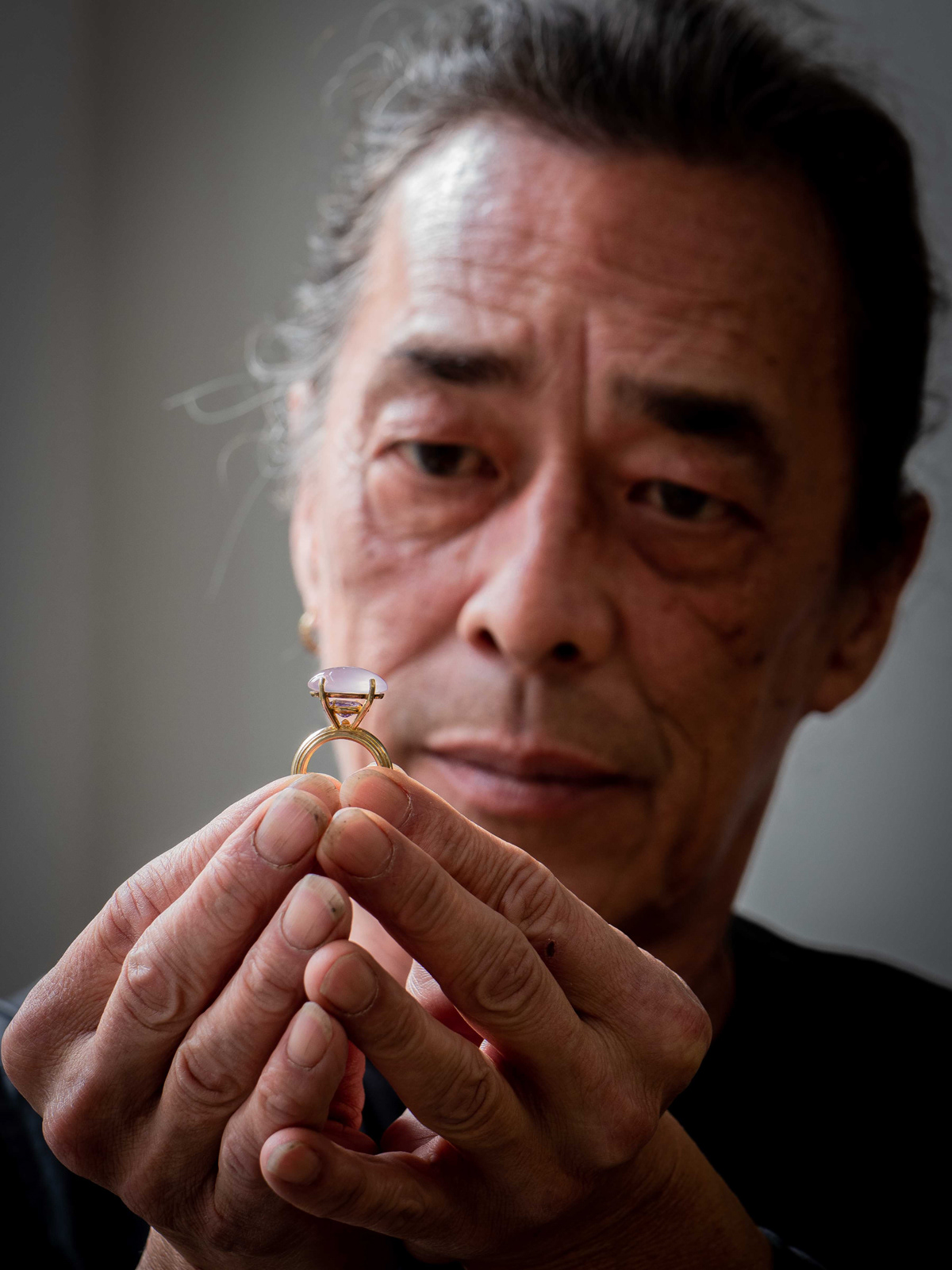
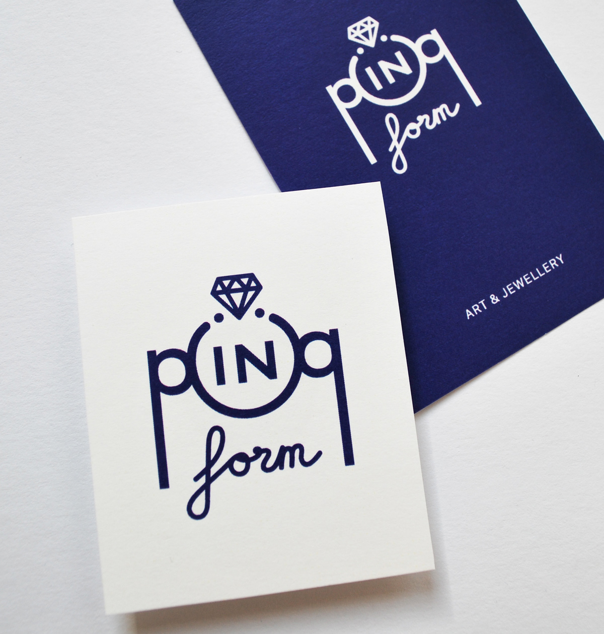
Photo credit for Ping's portrait: Kees Oosterholt