
THE BLUE ISLES — Brand Identity ✻ 2023
Client name: Emi Aoshima
Our paths crossed with Emi thanks to Lisa Hall. Emi was looking for a brand designer who can visualise the concept Emi had in her mind for her handmade artisan soaps and bath products brand. Emi, originally from Japan creates soaps, bath fizzers and body scrubs in her home, using natural ingredients such as matcha tea from her land of origin. 'Aoshima' in Japanese means 'blue island' and this is where the original name of her brand comes from. Emi creates potteries as werll, next to bath products and soon she is planning to sell them on her online shop Lisa will be building for her.
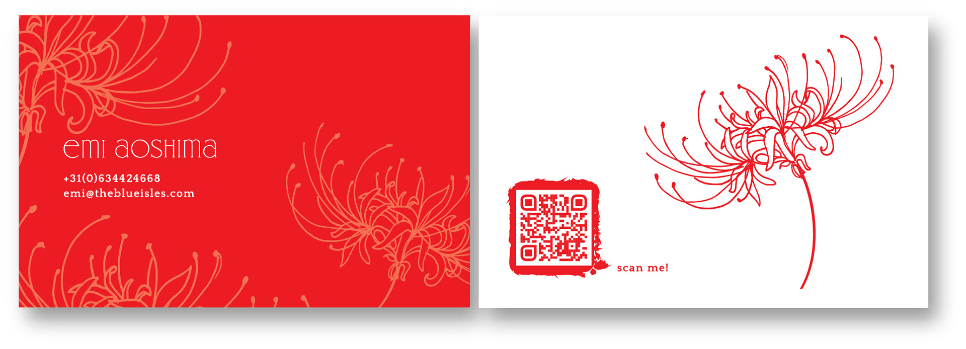
For the branding, the point of inspiration was the red spider lily, a flower that originates from China, Japan and Korea with an unusual beauty. When blooming, its stamens extend outward from the flower's center. Emi resonates this flower with her brand and asked me to stylise it in a elegant and delicate way putting forward the wild beauty of it. We have come to an aggreement to use an organic circular form for her logo as the products are handmade with love and care and the intention was to create a positive emotional message.
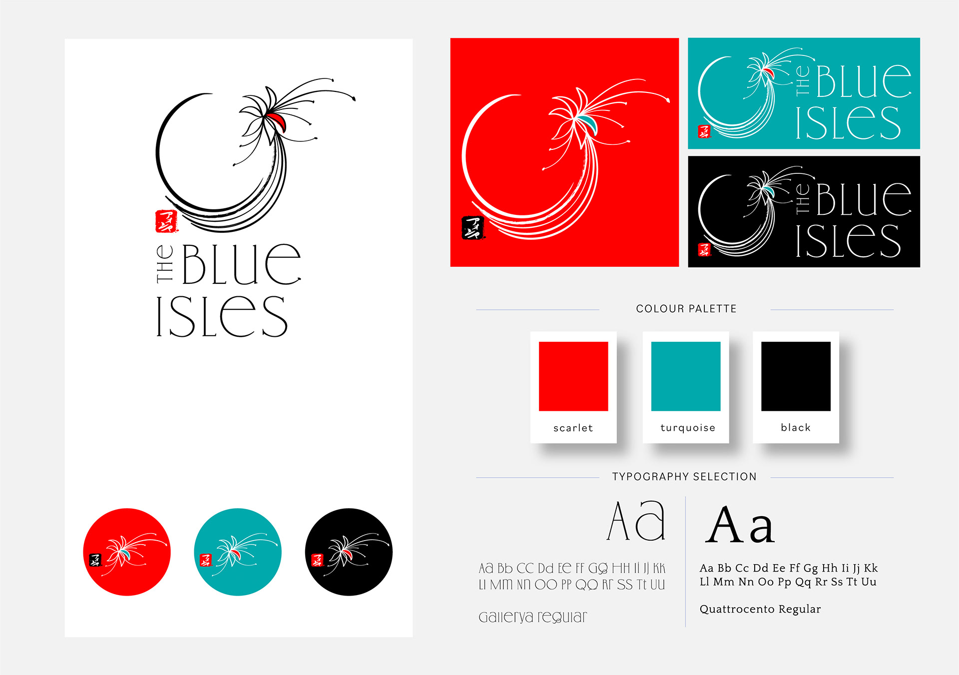
I have first hand drawn the lily and then focusing on its petals, tried to simplify a part of the little flower making it sit on a stem that I curved around it. The colours we have gone for were Emi's initial choices. I kept them bold and clean, making the passionate and brave scarlet red the dominant colour in the palette. Turquoise symbolises calmness, relaxation and peace. It also represents rebirth.
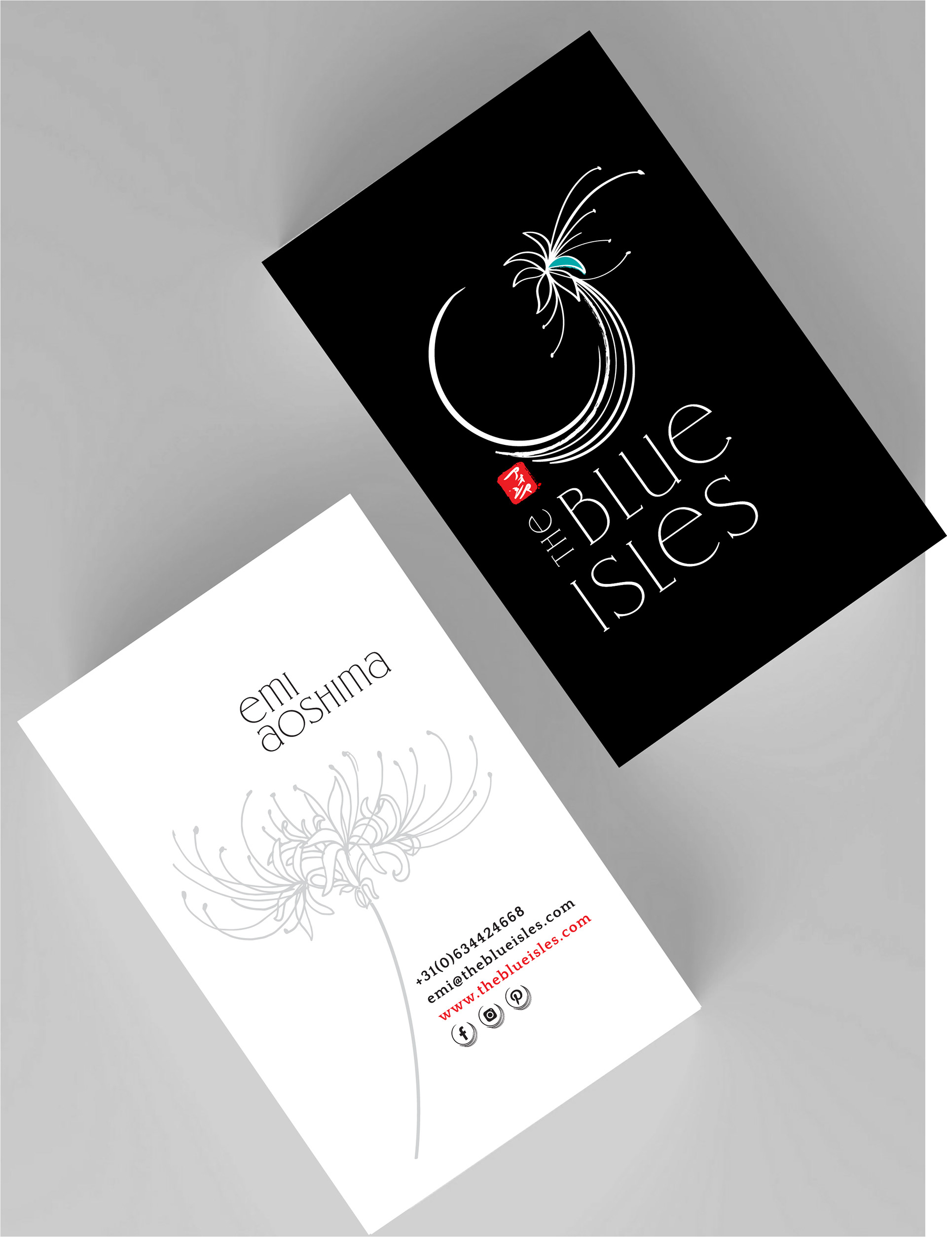
Emi also wanted to use a seal that resembles actual Japanese seals, by the corner of the logo design, which reads 'Aoshima' in Japanese. For the brand typeface, I have chosen an intricate font style having the same character style with the lily drawing. Once the logo design was completed, we have also worked on Emi's business and thank you cards, wrapping paper that she would later use to package her soaps and also some stickers she can use on her products.
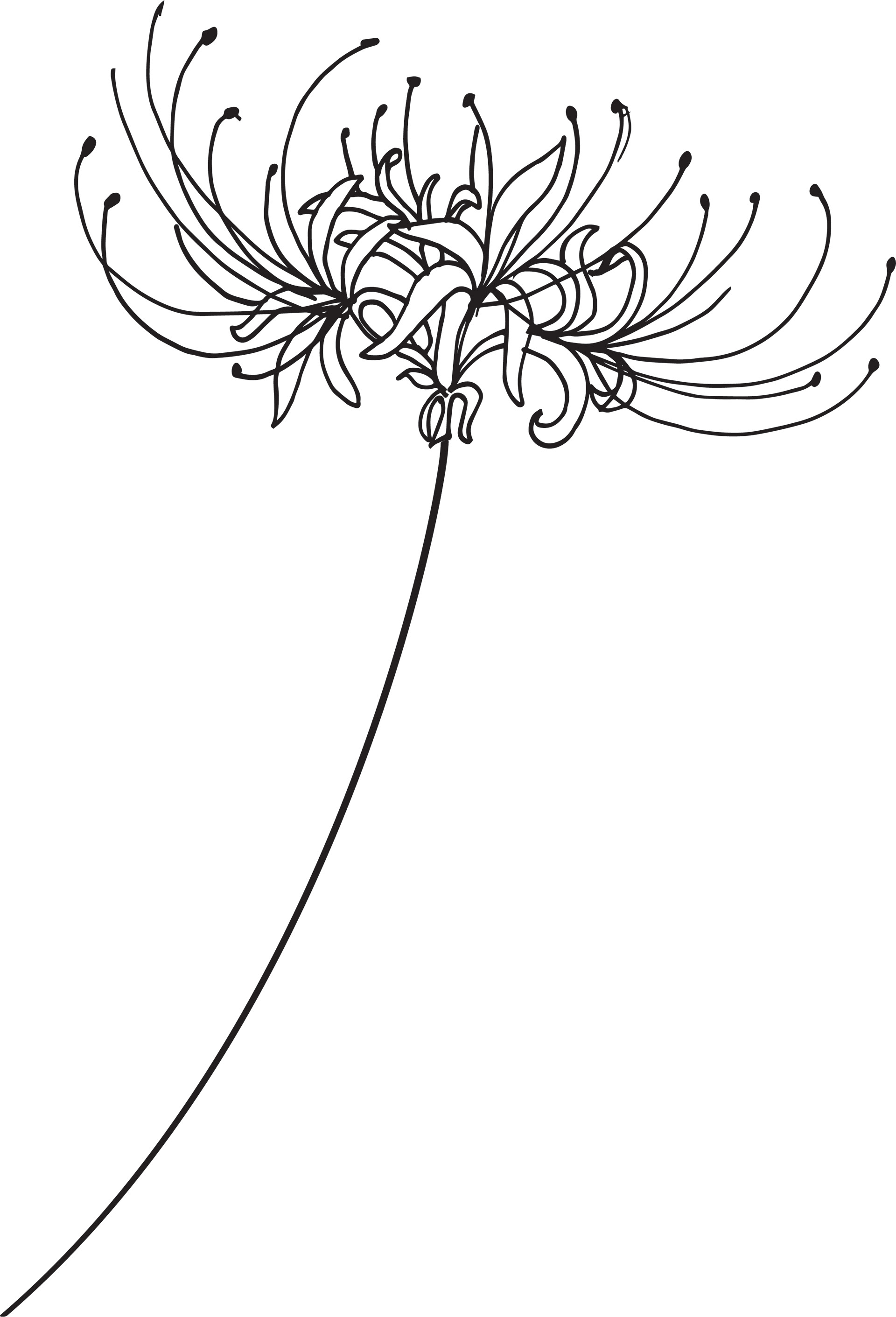
Spider lily illustration for the wrapping paper and business cards
I wish Emi Aoshima all the best in her journey with The Blue Isles and hoping her new branding brings lots of luck and great sales for her business. Soon Emi will have her website going live thanks to Lemonberry.
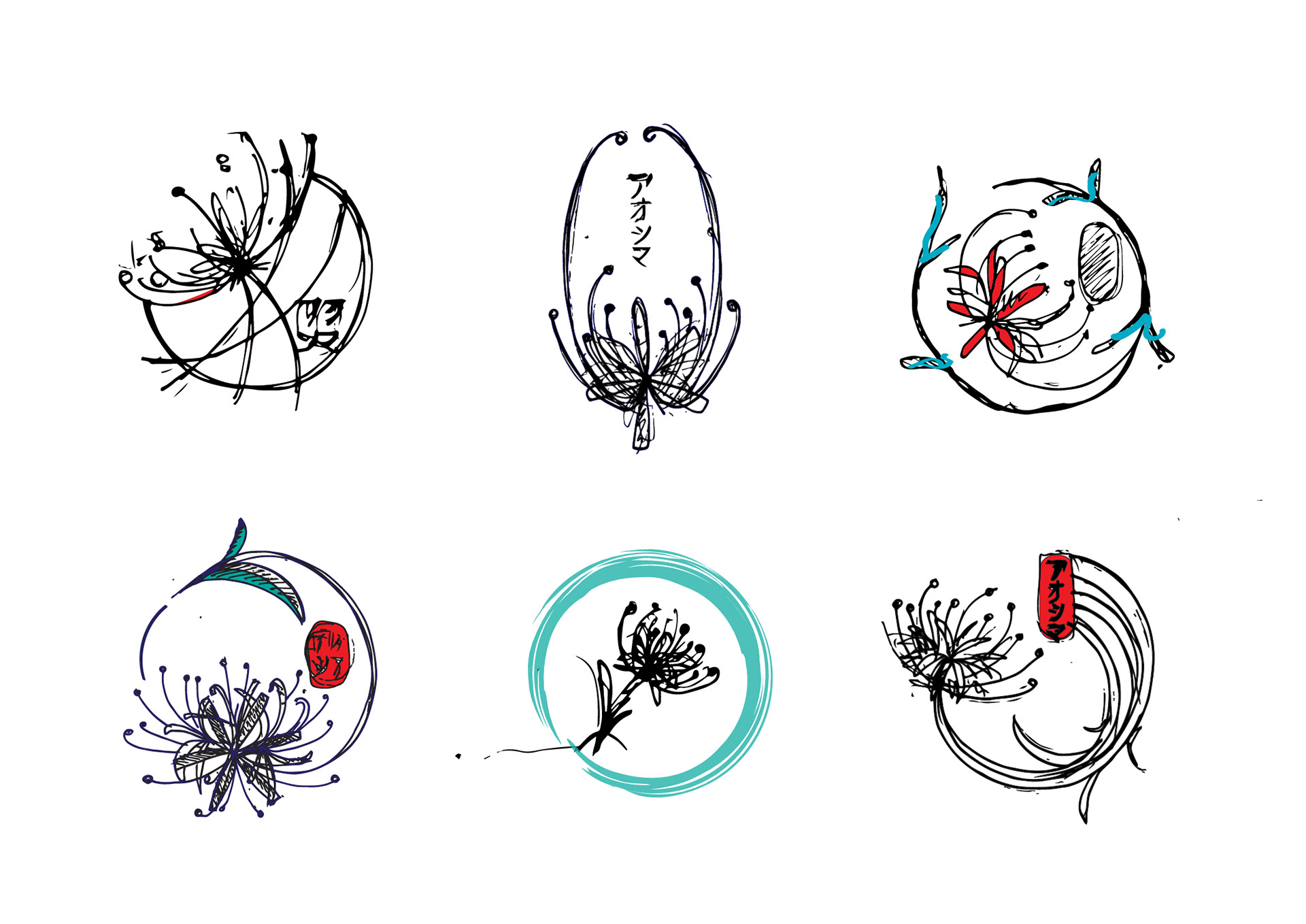
Initial sketches for the logo design
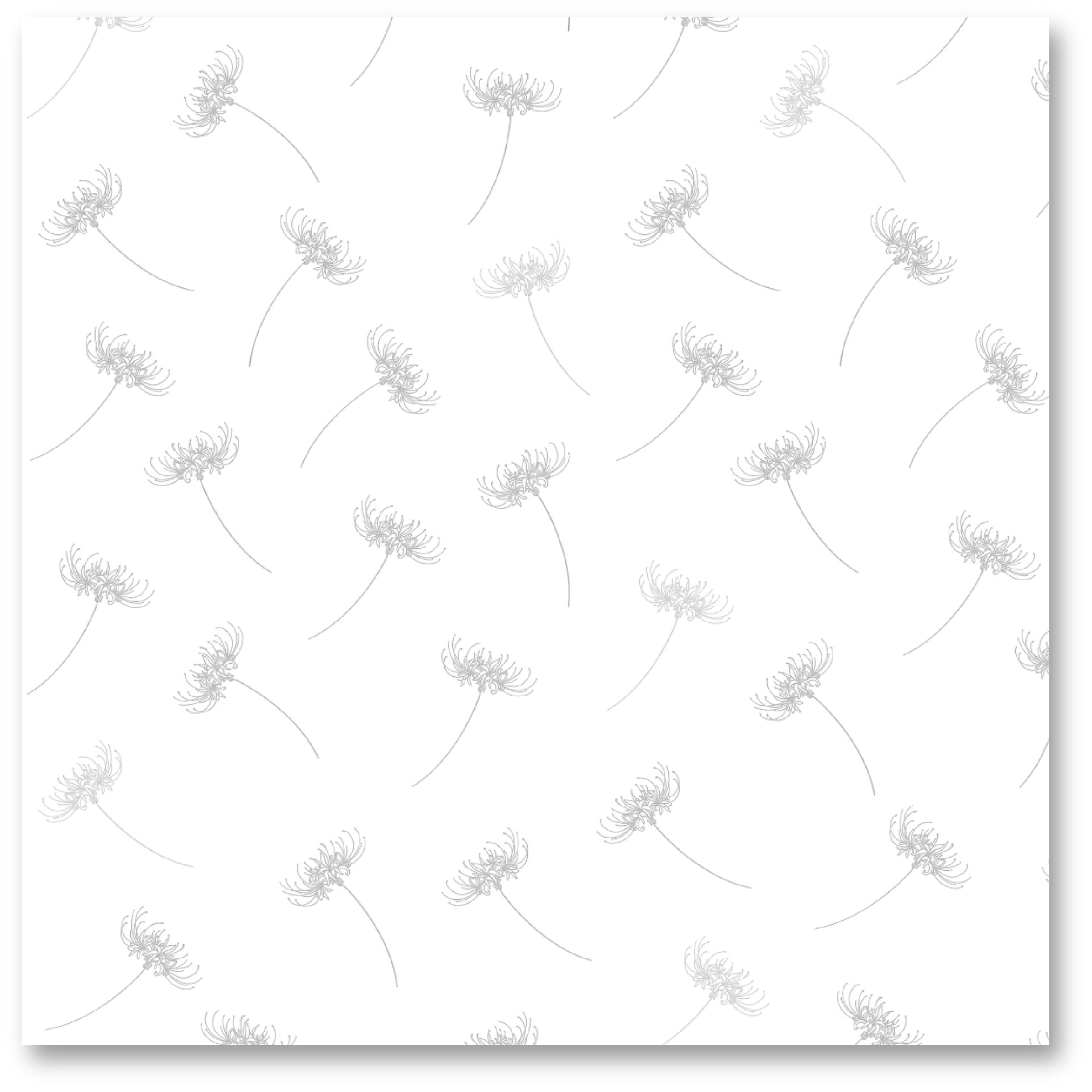
Wrapping paper design